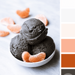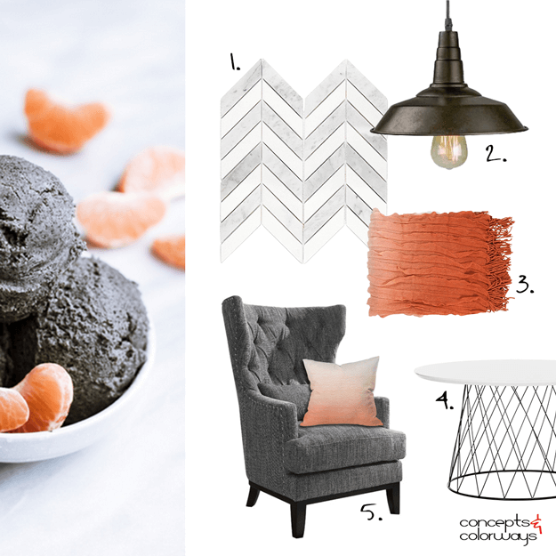
Creating an interior design mood board from the ‘Opposites Attract’ color palette was a lot of fun! I really like how it turned out. It has a modern look to it with an industrial vibe and some traditional pieces as well. A gray and white chevron mosaic tile could be used on the walls or floor. The dark grayish-brown of the gelato translates to an upholstered wingback chair and dark bronze barn light. A white modern coffee table reflects the material of the bowl. Then, the look is finished off with the blood orange and peach tones of the oranges in a throw blanket and ombre pillow. The contrast in this look is so nice!
Here are the pieces I used to create the ‘Opposites Attract’ look…
1.Chevron Marble Mosaics | 2. Barn Light | 3. Ombre Throw | 4. Roe Coffee Table | 5. Wingback Chair – Peach Ombre Pillow

Now, for a look at the ‘Opposites Attract’ paint palette…

Coordinating posts you might like…