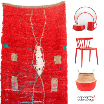
Do you have a favorite color? You know, that one color that you’re always drawn to and you just can’t get enough of? For me, that color would be bright red. It isn’t an easy…
Color and Interior Design Inspiration Blog
Do you have a favorite color? You know, that one color that you’re always drawn to and you just can’t get enough of? For me, that color would be bright red. It isn’t an easy…
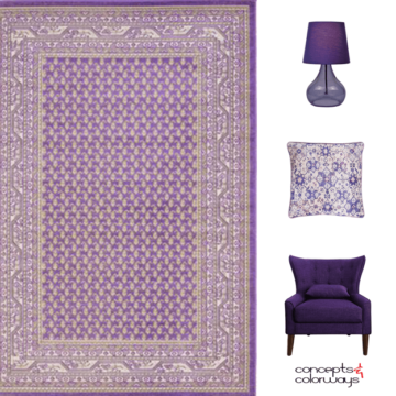
Today’s color is not for the light of heart. It’s called Pantone Ultra Violet for a reason folks and you’ll need to be brave to tackle this brazen hue. If you’re a fan of purple…
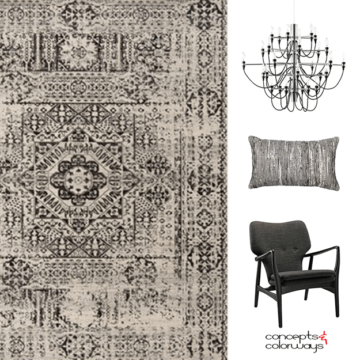
Of all the accent colors in the world, black has got to be the most versatile of them all. It also happens to be my favorite color of all time! I know, technically black is…
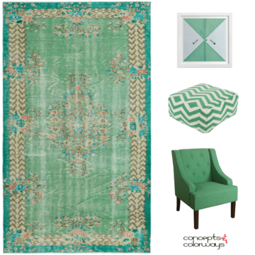
Lively green, indeed! This is a pretty kelly green that is full of life. It’s sort of like an emerald green or a jade green. You know, one of those colors that’s kind of hard…
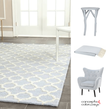
This color is like a breath of fresh air. It’s a pale blue-gray that I would describe as a delicate blue. There’s something very soothing about the subtlety of this blue. It’s a whisper of…
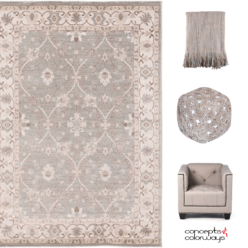
Taupe is such a great go-to neutral to use when putting together your interior color palette. It tends to be associated with traditional spaces. But, don’t overlook taupe when working with modern looks. When paired…
Copyright © 2026 Concepts and Colorways · Theme by 17th Avenue
