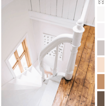
Sometimes, it’s the simple color palettes that make the biggest impact. Take the ‘Winter Oak’ palette for example. This color combo is a basic mix of white, cool gray, beige, caramel brown, dark brown with…
Color and Interior Design Inspiration Blog
Sometimes, it’s the simple color palettes that make the biggest impact. Take the ‘Winter Oak’ palette for example. This color combo is a basic mix of white, cool gray, beige, caramel brown, dark brown with…
I woke up this morning with a new idea for the blog. A new category actually that I’m going to call Interior Color Palettes. I’ve been stuck for a while on how to explore the…
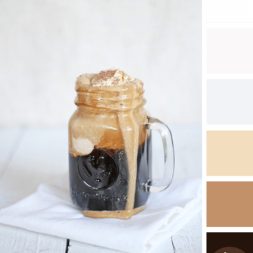
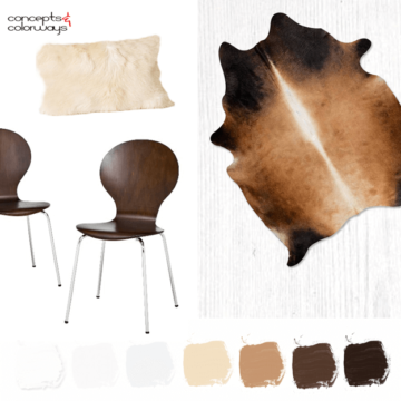
What a yummy color palette! The contrast of the cool white tones with the warm browns is just heavenly. Naturally, this enticing photo has me craving a root beer float. Luckily, Melissa over at Bisou…
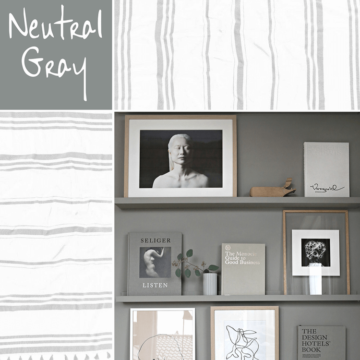
It always amazes me how the right shade of gray can make a design so darn pretty. I mean, gray is about as neutral and bland as you can get right? So, how can it…
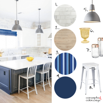
Yesterday, we looked at the Metals & Blues color palette with that gorgeous navy and white combo that I love. Today, I want to take a closer look at the materials and furnishings that make…
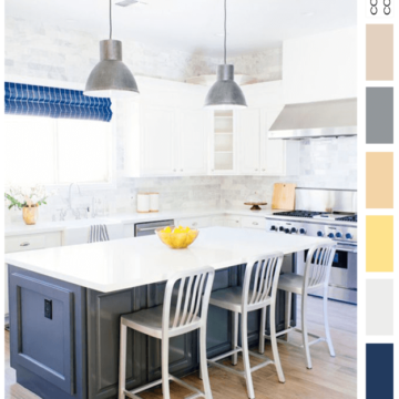
Navy and white. It’s a classic color combination that has always appealed to me. In fact, this kitchen design is something I would have chosen for myself. It’s fresh and cheerful but with the right…
Copyright © 2026 Concepts and Colorways · Theme by 17th Avenue
