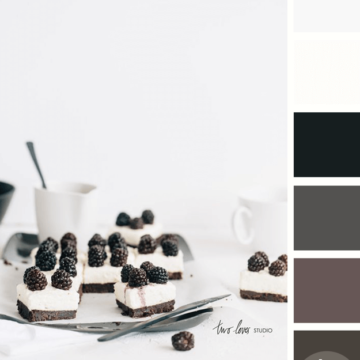
I like this take on black and white photography by Two Loves Studio. It isn’t really a black and white photograph but, instead is a photo of a black and white subject. What I like…
Color and Interior Design Inspiration Blog
I like this take on black and white photography by Two Loves Studio. It isn’t really a black and white photograph but, instead is a photo of a black and white subject. What I like…
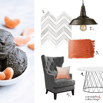
Creating an interior design mood board from the ‘Opposites Attract’ color palette was a lot of fun! I really like how it turned out. It has a modern look to it with an industrial vibe…
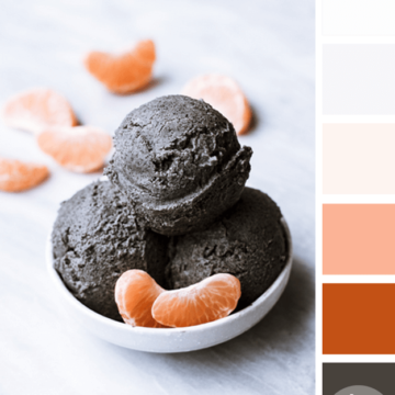
The ‘Opposites Attract’ color palette is inspired by a black sesame gelato recipe from Super Nummy. It features the grayish-brown color trend from Sherwin Williams called Sealskin that I showed you here. The rest of…
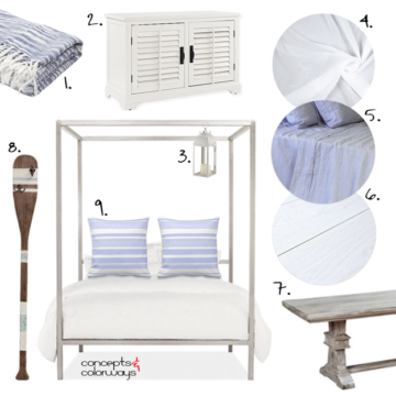
I’ve been dreaming of the beach lately. We’re planning a little trip next month and I just can’t wait to get there. Today’s ‘Beach Breeze’ look is all about the white cottage beach style. Picture…

The ‘Lavender Cheesecake’ look is a gorgeous white interior with small pops of periwinkle and navy. The floor is a grayish-brown vintage oak plank and the walls are a pale ivory white paint. Sage gray…
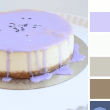
I’m always up for a dessert based color palette. This lavender drizzle makes such a beautiful display for your table but you could also use this palette for other designs. The color lineup for this…
Copyright © 2026 Concepts and Colorways · Theme by 17th Avenue
