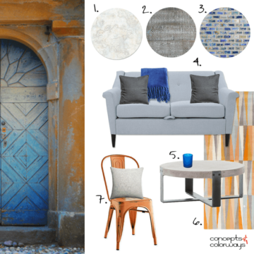
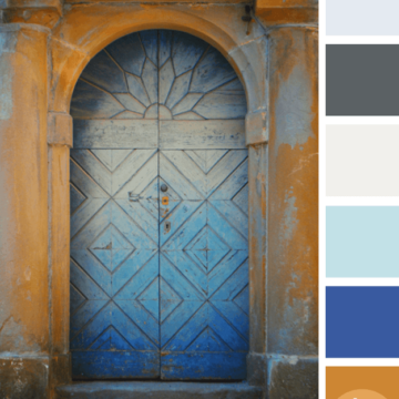
Here I am, inspired again by another awesome door design. This Italian door has a spicy balance of burnt orange tones with cool blue-gray colors. If I were to translate this look into an interior…
Color and Interior Design Inspiration Blog
Here I am, inspired again by another awesome door design. This Italian door has a spicy balance of burnt orange tones with cool blue-gray colors. If I were to translate this look into an interior…
I’m continuing my exploration of color palettes featuring the burnt orange color trend and this ones a good one. It has a collection of cool blue and gray tones to balance out the rusty warmth…
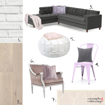
The ‘Mental Vacation’ look is inspired by colors pulled from a beach sunset with lilac grays, pale pinks, blush rose and rose beige tones. It’s an incredibly soothing palette than is just perfect for a…
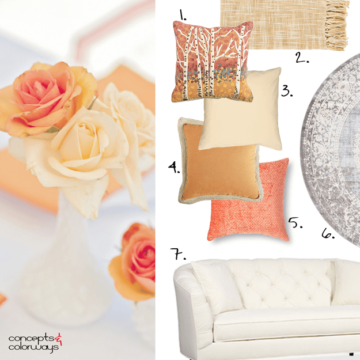
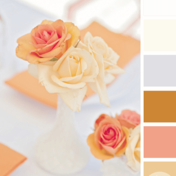
I can’t get over how gorgeous this color palette is! The inspiration comes from a table setting photograph with orange, peach and cream flowers. To translate this look into an interior design, I picture a…
The ‘Sensational Citrus’ color palette is a gorgeous blend of pale gold, coral peach and tangerine orange. Small amounts of cream and burnt orange are also part of this look. The primary colors used in…
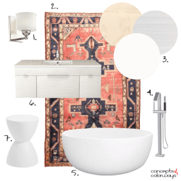
Sometimes, it just takes one design piece to totally change the style of a room. Take this Persian rug for example. It has such bold patterns and colors that it can single-handedly pull an interior…
Copyright © 2026 Concepts and Colorways · Theme by 17th Avenue
