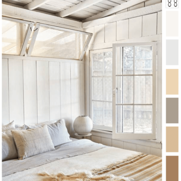
Sometimes, a simple warm-toned color palette is just what a design needs. Take this bedroom interior for instance. It’s just beautiful in it’s simplicity with it’s creamy white walls, light gray linens and warm beige…
Color and Interior Design Inspiration Blog
Sometimes, a simple warm-toned color palette is just what a design needs. Take this bedroom interior for instance. It’s just beautiful in it’s simplicity with it’s creamy white walls, light gray linens and warm beige…
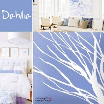
Would you say this color is a periwinkle blue? I think that best describes it. Or, maybe you would say it’s a lavender blue? Sherwin Williams calls it Dahlia and it certainly is a soothing…
Now, here’s a play room with some style! It’s playful enough for kids to love it but in a contemporary way that appeals to adults as well. The foundation of the look is a warm…
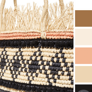
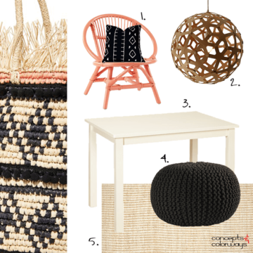
Natural warm tones with some high contrast black accents. Now, that’s what I’m talking about! This look is given a softer touch with the pale peach details. I like that this color palette is warm,…
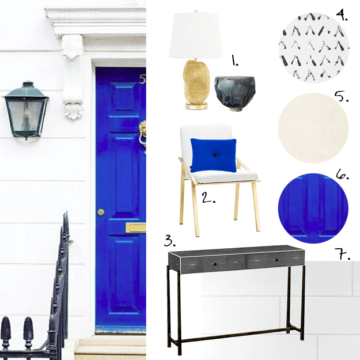
Have you ever looked at a beautiful front door and wondered what was on the other side of it? I do this all the time. It’s just how my ‘designer’ brain works. When I look…
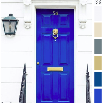
I am obsessed with this shade of blue! There are many names for it: royal blue, cobalt, sapphire, and sometimes just bright blue. Pantone calls it ‘Lapis Blue’. Whatever the name, it’s a gorgeous focal…
Copyright © 2026 Concepts and Colorways · Theme by 17th Avenue
