The ‘Graphic Vibe’ palette translates beautifully into an interior design. What I like best about this look is the largest surfaces and pieces are neutral colors. So, you can inexpensively switch out the accent colors…
Color and Interior Design Inspiration Blog
The ‘Graphic Vibe’ palette translates beautifully into an interior design. What I like best about this look is the largest surfaces and pieces are neutral colors. So, you can inexpensively switch out the accent colors…

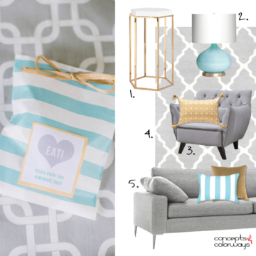
So many pretty colors bundled in one gorgeous combination. This palette is definitely a keeper! The star player of this look is a beautiful light turquoise, paired with white, in a bold, modern stripe. This…

How would I describe this color? I think the best description would be a lime green. But, apple green, bright green or spring green would also work. It’s essentially a saturated green color with a…
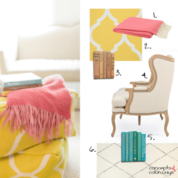
Yesterday, we explored the ‘Primrose Vision’ color palette but, how do you create an interior design in this look? Let’s go over the individual elements that make up this design. You’ll want to start with…
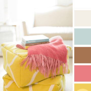
I’m a huge fan of color palettes with neutral base tones and small amounts of colorful accents. Using bold, saturated colors sparingly seems to lend more drama to the overall look. And, It’s a nice…
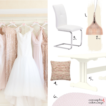
Yesterday we looked at the ‘Blush Beauties’ color palette. So, today let’s explore how we can translate this palette into an interior design. I’m picturing a dining room with a blush beige wall paint and…
Copyright © 2026 Concepts and Colorways · Theme by 17th Avenue
