Turquoise has really been a crowd favorite lately. And I, for one, am thrilled! I've loved this pretty little blue-green color since way before it was a trend. Now, it's being recognized by the masses for it's sheer awesomeness. In fact, Sherwin Williams has a version of turquoise they call ...
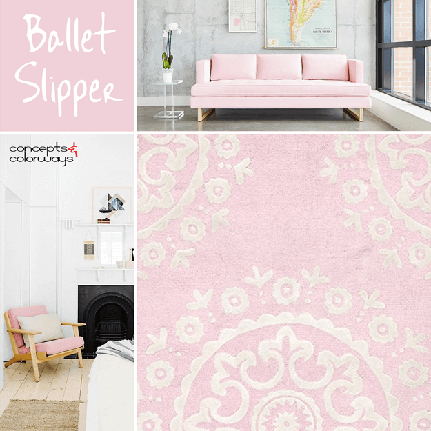
PANTONE BALLET SLIPPER
This is, hands-down, the prettiest color in the Pantone Fall 2017 Fashion Color Report. It's a soft shade of blush pink that adds a feminine touch to any interior space. I especially like this color trend as accents in white and pale gray interiors. But, it also works great with dark gray and black. ...
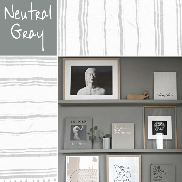
PANTONE NEUTRAL GRAY
It always amazes me how the right shade of gray can make a design so darn pretty. I mean, gray is about as neutral and bland as you can get right? So, how can it literally transform a space from a dull room to a showpiece? One particular shade of gray that really catches my eye is Pantone's Neutral ...
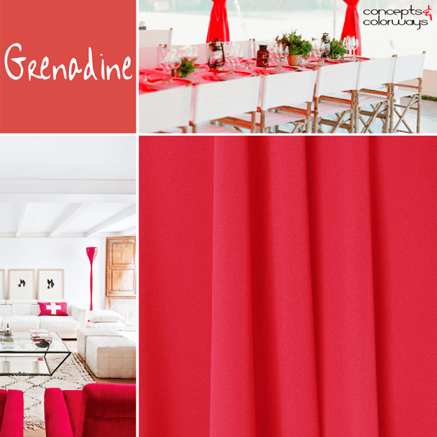
PANTONE GRENADINE
Today's color trend is a personal favorite of mine. It's a bright red color that Pantone calls Grenadine. It's part of their Fashion Color Report for Fall 2017. This particular shade of red is a lively one that simply commands attention. I love seeing it in white interiors and also with greys and ...
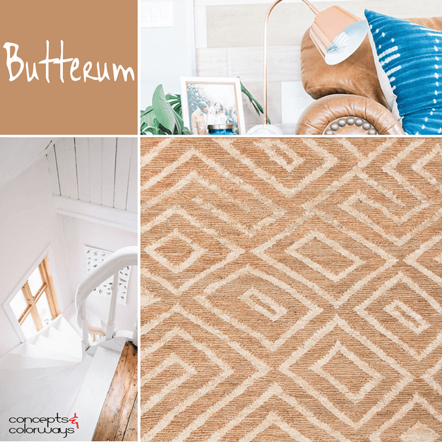
PANTONE BUTTERUM
Mmm...Butterum. This color trend looks as yummy as it sounds. I've been particularly smitten with this particular shade of light brown for some time now, especially in leather pieces. I even have a pair of riding boots in this shade that I wear all winter long. Pantone has included 'Butterum' in ...
- 1
- 2
- 3
- …
- 5
- Next Page »


