I'm totally loving this purple and green color combination. Especially against a white backdrop. The soft beige tones, copper and slate blue tones add interest while maintaining harmony in the look. This color palette would make a beautiful interior design. Don't you think? Coordinating posts ...
FLORAL AFFECTION
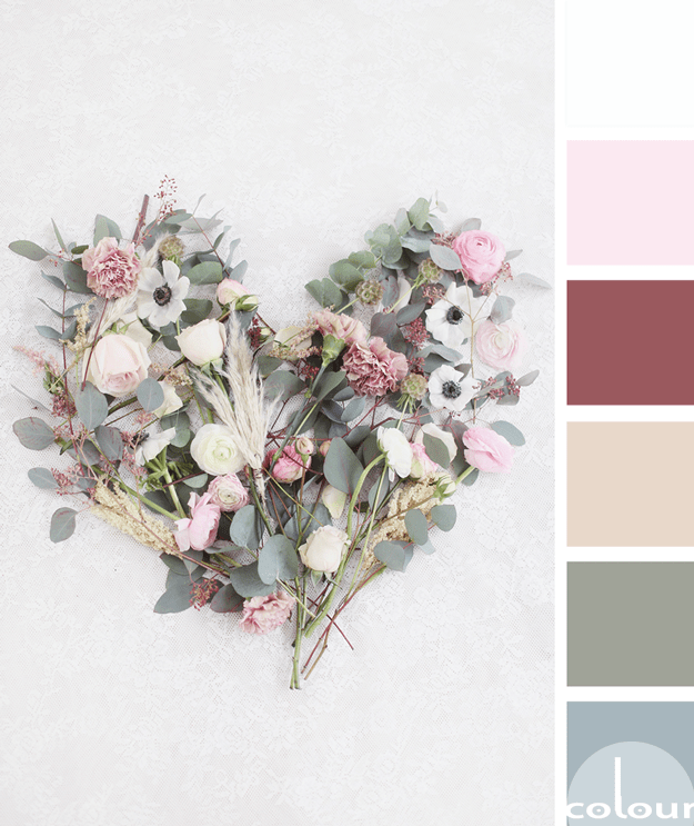
I'm continuing my exploration of olive gray color palettes with this beautiful floral inspired look. The olive tones are paired with a collection of blue-gray, soft beige, burgundy, soft pink and cool white. The combination has a nice complexity to it but in a soft, tranquil sort of way. What do ...
HAZY FOREST
So, how would you translate this color palette into an interior design? I have a few ideas brewing for this look. Like, a layered rug effect for starters. Place a weathered gray rug down as the base and layer this with a round rattan rug. For the walls, go with a pale blue color and a weathered ...
BASHFULLY GROUNDED
So, how would you translate this color palette into an interior design? Here's a little something I came up with for this look. Start things off with a taupe toned wood-look flooring. Pair this with a soft beige wall paint with a hint of blush pink. Continue the blush pink tone in an area rug to ...
PAVILION OASIS
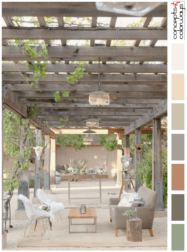
Would you like to 'Get This Look' for yourself? This outdoor living area would translate beautifully into an indoor space. Start this look with a sand colored floor tile and a taupe colored wallpaper. Include an accent wall with a gray-brown reclaimed wood paneling. Add a light beige area rug to ...


