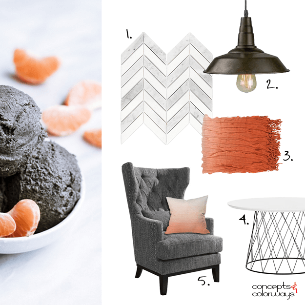
Creating an interior design mood board from the 'Opposites Attract' color palette was a lot of fun! I really like how it turned out. It has a modern look to it with an industrial vibe and some traditional pieces as well. A gray and white chevron mosaic tile could be used on the walls or floor. The ...
OPPOSITES ATTRACT
The 'Opposites Attract' color palette is inspired by a black sesame gelato recipe from Super Nummy. It features the grayish-brown color trend from Sherwin Williams called Sealskin that I showed you here. The rest of the palette is a blood orange, light peach, pale peach, cool gray and cool white. ...


