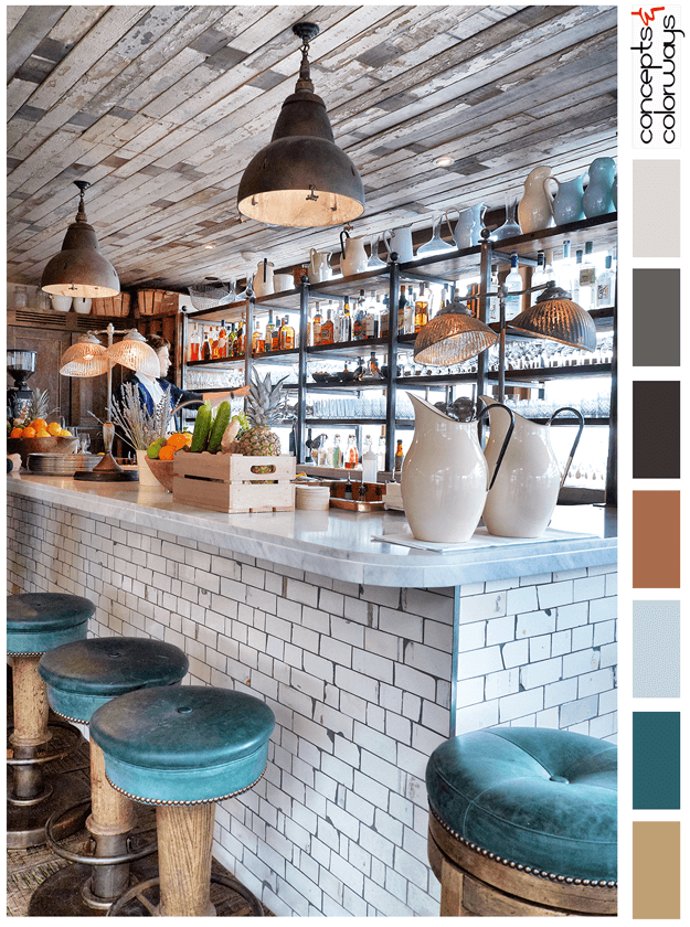
The 'Happy Hour' palette is a chill look with a "put your feet up and stay a while" kind of vibe. This look is all about reclaimed wood, weathered subway tile and dark teal accents. The color palette consists of a light brown, dark teal, pale blue, copper brown, warm black, charcoal gray, pale gray ...
RESTFULLY CHIC
When it comes to bedrooms, I want a relaxing design that sets my mind at ease. This 'Restfully Chic' look fits the bill perfectly. I could definitely picture myself unwinding after a long day in this lovely bedroom. The color palette gets the credit for creating such a restful vibe so, let's look at ...
DRAMATIC FLAIR
The 'Dramatic Flair' palette is a dark one with small amounts of white accent. It's great for eclectic style interiors, industrial modern styles and anywhere you want a dramatic flair. The color line-up includes a cool black, charcoal gray, burnt orange, dark bronze, emerald green, golden yellow and ...
NATURALLY BOLD
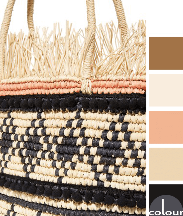
Natural warm tones with some high contrast black accents. Now, that's what I'm talking about! This look is given a softer touch with the pale peach details. I like that this color palette is warm, natural, pretty and bold all at the same time. I can picture this combination being used in so many ...
LAPIS WHITEOUT
I am obsessed with this shade of blue! There are many names for it: royal blue, cobalt, sapphire, and sometimes just bright blue. Pantone calls it 'Lapis Blue'. Whatever the name, it's a gorgeous focal point in this stunning color palette. I especially like this shade of blue in a mostly white ...
- « Previous Page
- 1
- 2
- 3
- 4
- 5
- 6
- …
- 9
- Next Page »


