
I've got to ask you something. How do you feel about Palace Blue? It's one of the brightest color trends on the Pantone 2018 Spring Color Report which always makes me wonder if people will really embrace it for their homes. Personally, I think it's gorgeous. It's like the perfect blend of royal ...
90a1bb | A PERIWINKLE BLUE

Periwinkle blue is such a refreshing color. It adds a heavenly touch to any room that I find relaxing. I especially like how this sky blue color looks when paired with dark wood tones and shades of white. If you're looking for some blue decor in this particular shade, I've got you covered. Let's ...
374057 | AN ENCHANTING BLUE
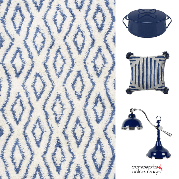
There's nothing quite like the refreshing feel of a navy blue. It's a timeless classic that's also making a strong comeback in the world of color trends. I absolutely love blue decor! It looks especially good with gray or white walls and a brown toned wood floor. My heart is happy just thinking ...