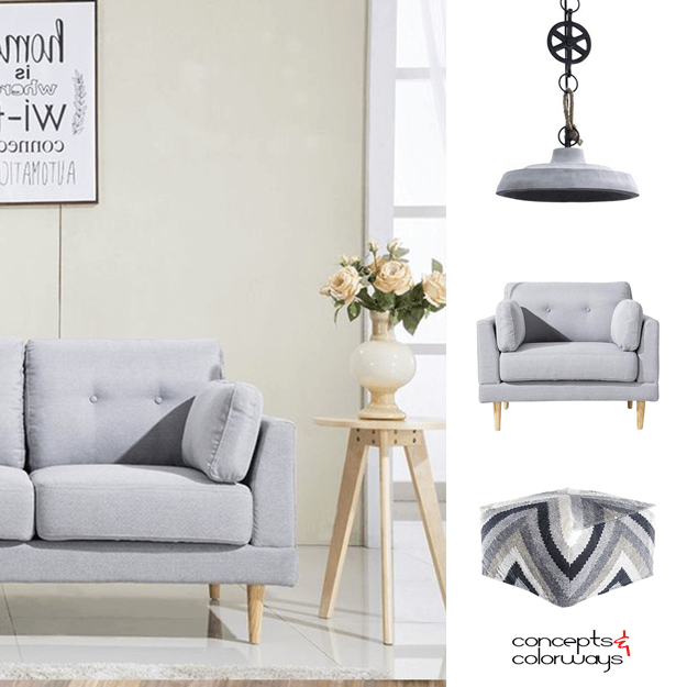
You know, I've always been a fan of bold color accents when it comes to interior design. But, sometimes you just need a go-to neutral. Something like this dove gray would do the trick. It could also be described as a stone gray, blue gray or neutral gray. Pantone actually calls it Harbor Mist. But, ...
ebeef4 | A DELICATE BLUE
This color is like a breath of fresh air. It's a pale blue-gray that I would describe as a delicate blue. There's something very soothing about the subtlety of this blue. It's a whisper of sky blue that adds a heavenly touch to any interior design. I especially like how this hue looks with warm gray ...
RUSTIC BRILLIANCE
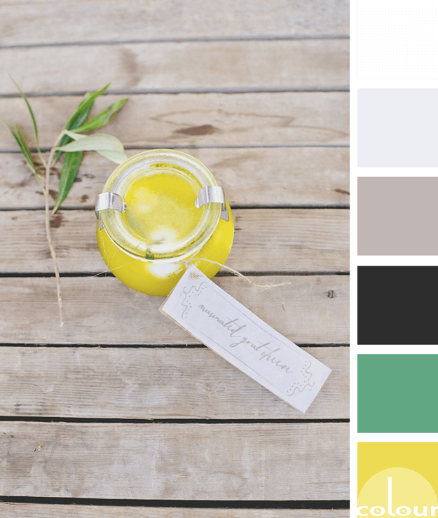
There's something about a bright yellow that just brightens up my day. It's about the happiest, most cheerful color I believe I've ever met. Pantone has included this particular shade of yellow in their Fashion Color Trend Report for Spring 2018. They call it Meadowlark. So, naturally I wanted to ...
DEEPLY COLORFUL
Wedding bouquets are often the subject of my color palette inspiration. This one really caught my eye because of it's unique color combination. I never would have considered using this group of colors together but the result is surprisingly pretty. The dark steel gray dress in the background is the ...
MAGICAL THINKING
The 'Magical Thinking' palette is a soft ivory look with harmonious accents in a blue-black, plum and copper brown. This palette has layers of light tones such as blush beige, ivory, vintage white and blue-gray. The whole combination comes together with a spunky vibe yet oh so relaxing. I love ...
- 1
- 2
- 3
- …
- 6
- Next Page »


