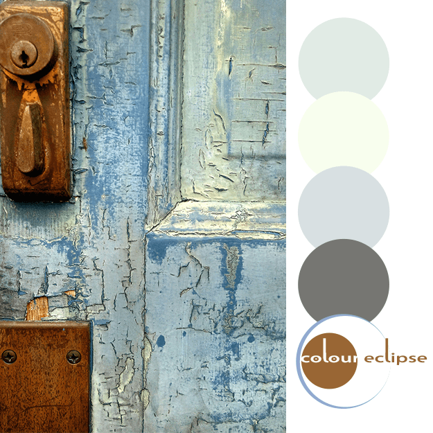
I'm totally loving this purple and green color combination. Especially against a white backdrop. The soft beige tones, copper and slate blue tones add interest while maintaining harmony in the look. This color palette would make a beautiful interior design. Don't you think? Coordinating posts ...
SAUSALITO ELEGANCE
Do you ever get inspired by a catalog photo? Maybe you love the design style or the color palette really grabs you. It happens to me all the time and my latest obsession is with this living room by Horchow. First off, I just love Horchow! And, they really knocked it out of the park with this look ...
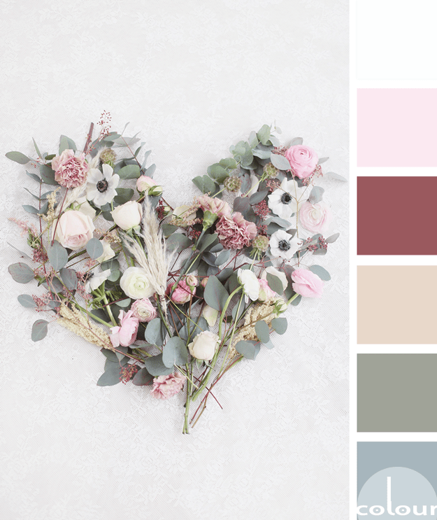
FLORAL AFFECTION
I'm continuing my exploration of olive gray color palettes with this beautiful floral inspired look. The olive tones are paired with a collection of blue-gray, soft beige, burgundy, soft pink and cool white. The combination has a nice complexity to it but in a soft, tranquil sort of way. What do ...
SIMPLE SINCERITY
Okay, this bouquet is gorgeous! I absolutely LOVE the beautiful blue-green tones of the olive leaf contrasted with the white peonies. Add to that the warm whites, pale blush and blue-gray with just a touch of soft pink and this palette is stunning. I can definitely picture this combo in an interior ...
‘magnolia high’ palette
Here's an interior 'mood board' showing how I would translate this look into an interior design... Table: Walnut Dining Table by Blowing Rock Woodworks Flooring: Avella Reclaim Wood Gray HD Porcelain from Lumber Liquidators. Lighting: Quoizel Gaston Mini-Pendant from Lamps Plus. Bar ...


