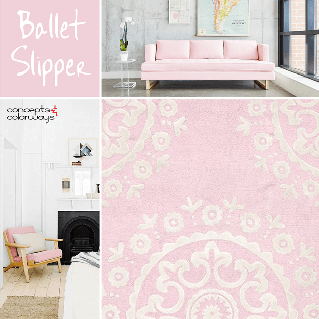
This is, hands-down, the prettiest color in the Pantone Fall 2017 Fashion Color Report. It's a soft shade of blush pink that adds a feminine touch to any interior space. I especially like this color trend as accents in white and pale gray interiors. But, it also works great with dark gray and black. ...
BLUSHING FACADE
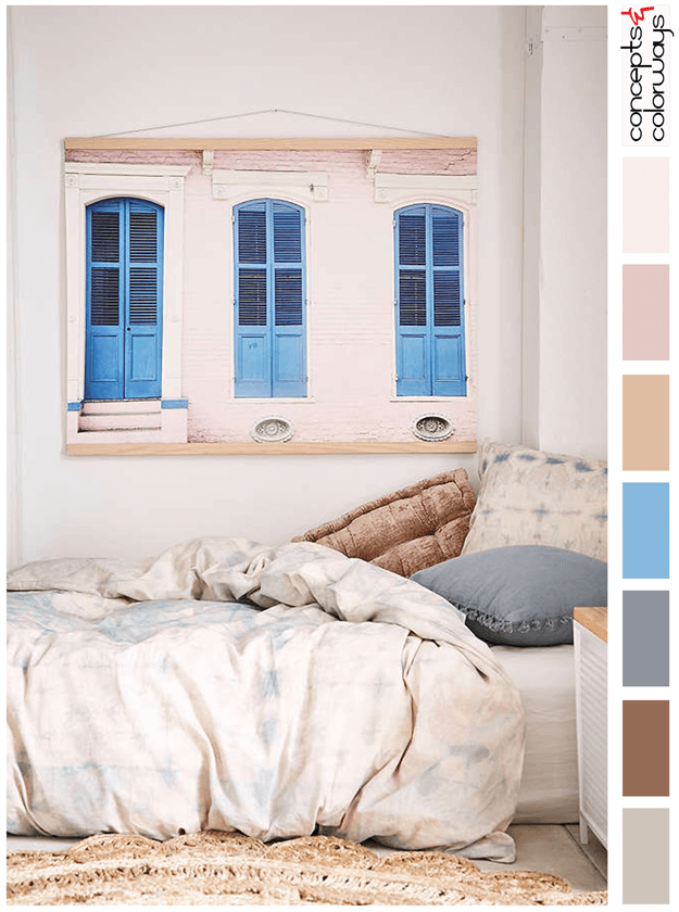
The 'Blushing Facade' palette is a playful combination of blush tones with a bright french blue for accent. The full color collection is a warm taupe, russet brown, steel gray, bright french blue, blush beige, dusty pink, and pale pink and pinkish-white. This is a colorful combo inspired by a photo ...
MENTAL VACATION

The 'Mental Vacation' look is inspired by colors pulled from a beach sunset with lilac grays, pale pinks, blush rose and rose beige tones. It's an incredibly soothing palette than is just perfect for a restful living retreat. Here's what I picture for this look. The flooring would be a white oak ...
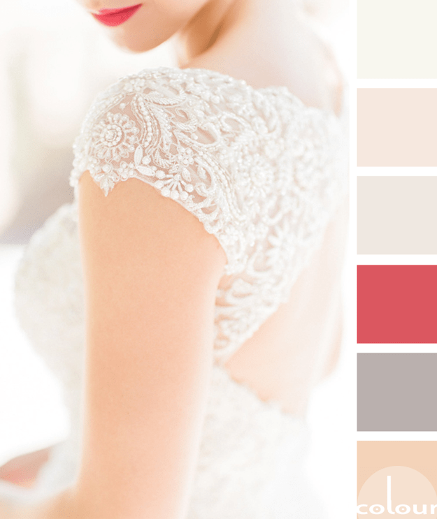
BLUSH BEAUTIES

What a heavenly color palette! I just love the layers of blush tones and creams with an accent of white and rose gold. This look is pretty enough for a little girls room but is sophisticated enough to work for grown up girls too. It might be a bit too much pink for most men but it could work in the ...
FEARLESSLY FEMININE
My exploration of 'Simply White' has brought me across some truly inspiring design ideas. Here's yet another gorgeous look that features this warm white hue. In this palette, simply white is paired with taupe, rose quartz, light maple, soft peach and a bright pink accent. I call it 'Fearlessly ...