I'm a huge fan of color palettes with neutral base tones and small amounts of colorful accents. Using bold, saturated colors sparingly seems to lend more drama to the overall look. And, It's a nice way of adding a playful touch to an otherwise 'safe' room. The 'Primrose Vision' palette uses a creamy ...
PASTEL VISION
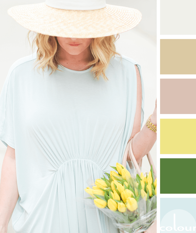
Today's palette is for the pastel lovers out there. If mint blues, canary yellows and spring greens really make you swoon, this might be the palette for you! I love the bold combination of bright colors mixed with a selection of more grounding, neutrals. The putty white, light brown and blush rose ...
PANTONE BUTTERCUP
Introducing, today's Color Trend: Buttercup! More specifically, Pantone 12-0752. Today's color was selected from the Pantone Fashion Color Report Spring 2016 Just a touch of 'Buttercup' in a neutral interior adds an eye-popping focal point to the space. Shop this color (some cool things I ...
GINGER CHAMOMILE
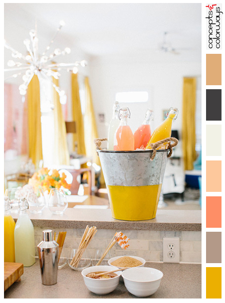
So, how would you translate this color palette into an interior design? Here's a little something I put together for this look... Pillow: Chartreuse, Chocolate Brown and Stone Grey Striped Pillow Cover from The Pillow Studio Flooring: Veranda by Daltile in Steel from South Cypress Rug: ...


