The copper brown and teal blue combo is really catching my eye lately. Take these Parisian doors, for instance. The depth of the copper and peacock blue doors contrasts beautifully with the light tan stone of the building. And, the black and gray accents add even more interest to the look. The ...
PURPLE MEADOW
I'm totally loving this purple and green color combination. Especially against a white backdrop. The soft beige tones, copper and slate blue tones add interest while maintaining harmony in the look. This color palette would make a beautiful interior design. Don't you think? Coordinating posts ...
BUTTERY DELIGHT
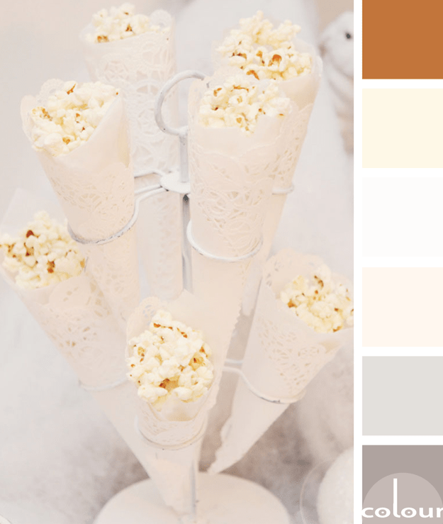
What a great idea for serving popcorn at a party. I love the cream colored doily cones! And, I especially like the color palette with it's buttery yellows, pinkish-creams, taupe grays and silver tones. This palette would translate beautifully into an interior design. Here's what I have in mind for ...
COPPER POP
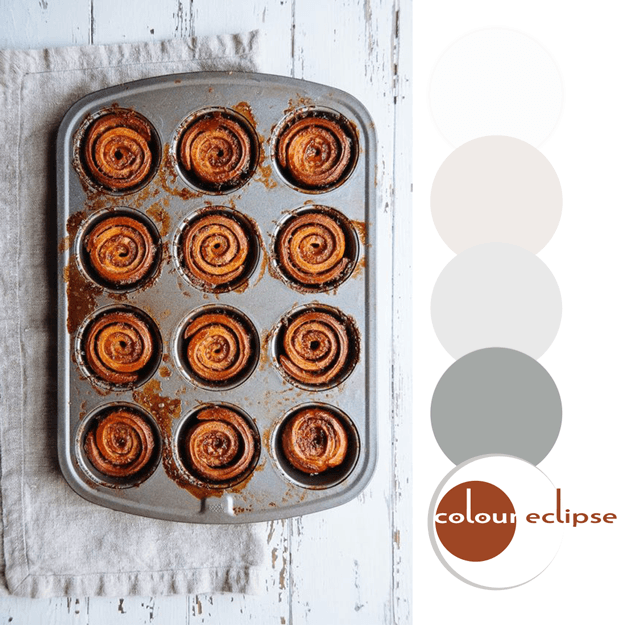
Mmm...sticky buns! They look delicious and are a great inspiration for an interior design. Metals, linens and white distressed woods with a pop of copper orange. I can just picture the space now.The walls would be a white washed ship lap wood with a feature wall of stainless steel mosaic tiles. ...
PANTONE POTTER’S CLAY
Introducing, today's Color Trend: Potter's Clay! More specifically, Pantone 18-1340. Today's color was selected from the Pantone Fashion Color Report Fall 2016. Or, add it to a white room as accents for a brighter look. 'Potter's Clay' is the perfect color to go for when working with ...


