
This buttery yellow is a mouthwatering color that's both creamy and bright. Some might call it a lemon or canary yellow. Personally, I think it's a lovely way to add a pop of color to a space. It looks especially good in gray or taupe rooms. If you're looking to add a sunny vibe to your home, this ...
NATURAL INSPIRATION
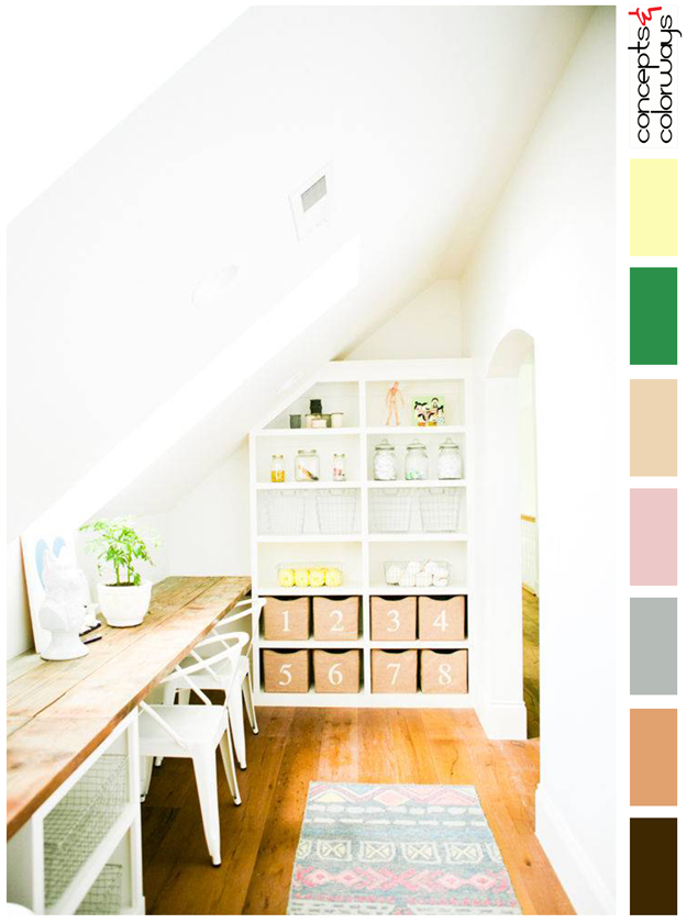
The 'Natural Inspiration' palette is set in a creamy white base with a foundation of natural wood tones in beige and copper brown. Small amounts of colorful accents are used in bright green, canary yellow, blush pink and warm gray. A dark brownish-black wood grain adds just the slightest amount of ...
PANTONE PRIMROSE YELLOW

Oh...yellow. It adds brightness and cheer in a way no other color can do. Strategically placed in interiors as accents, it can really make magic happen. I especially like the bright tones of this color such as the 2017 color trend, Primrose Yellow by Pantone. This sunny hue looks best in white and ...