I have an exciting guest post for you today from my new friends over at Décor Aid. They've offered to give us a personal tour of this beautiful mid century modern home from one of their talented designers, Sue B. I can't wait to get a closer look at this stylish home, so I'll turn it over to them to ...
A TEAL AND PINK COLOR PALETTE WITH A TOUCH OF CHARTREUSE
The popularity of teal in interior design is still going strong and I'm totally okay with that. It's a fun color with a retro vibe, yet it still feels modern. I really like what Decor Aid has done with teal in this mid century modern vacation home in Connecticut. The mix of teal and pink is a great ...
BABY FERN
The 'Baby Fern' color palette is based on an adorable party favor idea that's rocking the golden lime color trend. The complete color group is a spring green, lime green, black, warm brown, taupe and white. This combo has a warm, neutral feel with a lushness from the natural greens. I like the stark ...
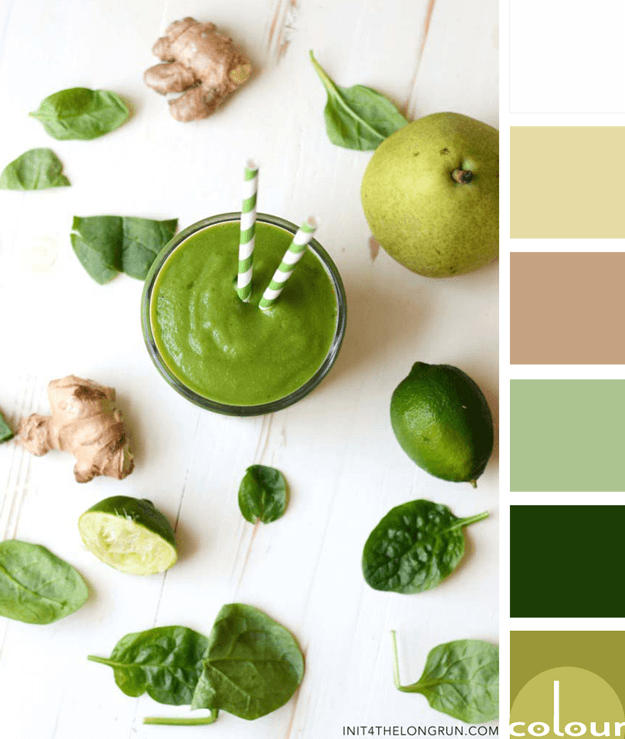
GREEN GODDESS
The 'Green Goddess' color palette is an unusual combination of greens on a creamy white base. The full color lineup is a chartreuse green, dark green, mint green, ginger brown, pear yellow and creamy white. The key to making this look work is to use all the accent colors sparingly in a almost ...
GREEN TEA
The 'Green Tea' color palette is a cheerful one with a beautiful balance of chartreuse and teal blue. This combo is inspired by a floral print fabric that would make a beautiful inspiration piece to build a design from. The full color palette is a gray-brown, chartreuse yellow, black, teal blue, sky ...


