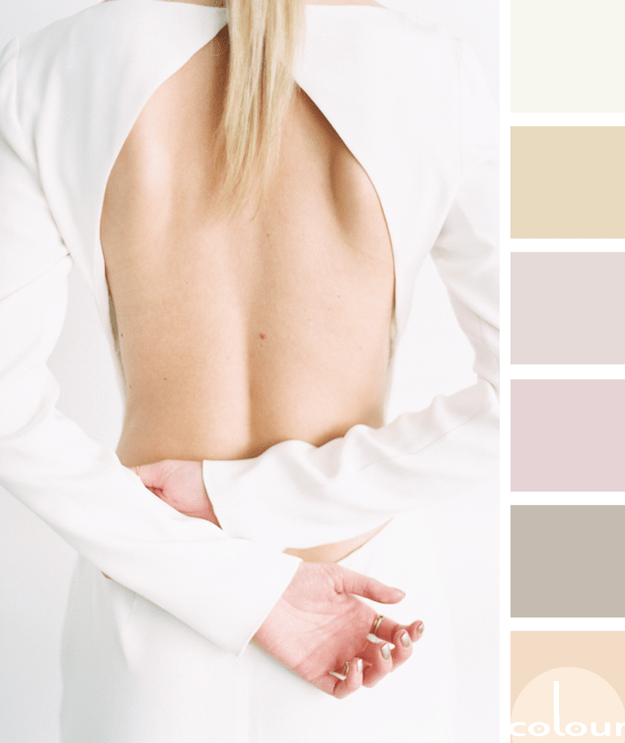
My exploration of 'Simply White' has brought me across some truly inspiring design ideas. Here's yet another gorgeous look that features this warm white hue. In this palette, simply white is paired with taupe, rose quartz, light maple, soft peach and a bright pink accent. I call it 'Fearlessly ...
TAILORED UNDERTONES
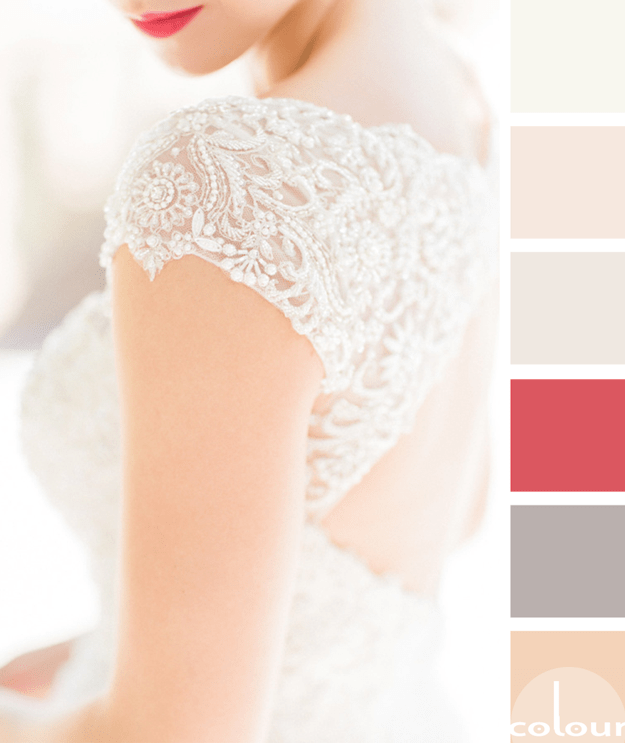
I have a friend who's been looking for a feminine color palette that's grown up. She didn't want the girlie 'pink everywhere' kind of look but still wanted an overall pretty vibe. So, I put together a look for her with a crisp white as the base and a mixture of light blonde, soft taupe and rose ...
DREAMY EXCURSION

If you're looking for a dreamy, white palette with a playful vibe, then this is the look for you. I love the subtle mix of creamy white and pale peach as the primary colors. But, when you add the bold 'pop' of black accents with just a hint of bright red and turquoise...that's when the magic ...
COLORFULLY VIBRANT

Wow! That was my first thought when I saw this photograph on Instagram. I love the composition and the color palette is a show stopper. The combination of black, chocolate brown, ivory and bright blue is unforgettable. This would make such a fun interior design. Here's how I picture this look ...
MAGNOLIA FROLIC
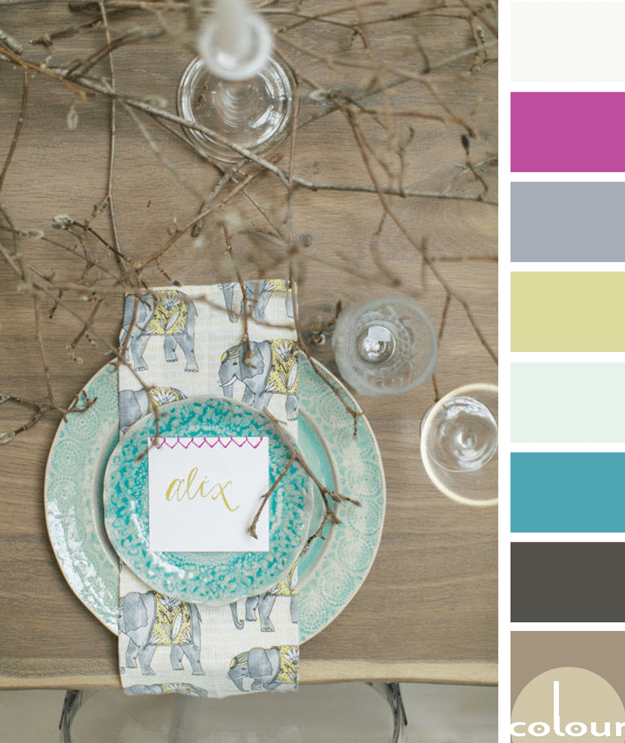
I just love rustic designs with a 'pop' of bright color. The 'Magnolia Frolic' palette is all that and more so, naturally, I love it! I'm especially drawn to the turquoise and chartreuse accents with just the slightest touch of hot pink. Lovely! Of course, I had to develop an interior mood board for ...
- « Previous Page
- 1
- …
- 8
- 9
- 10
- 11
- 12
- …
- 31
- Next Page »