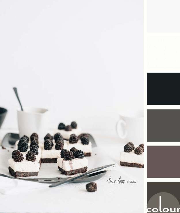
I like this take on black and white photography by Two Loves Studio. It isn't really a black and white photograph but, instead is a photo of a black and white subject. What I like most about this palette is that it isn't just black and white. Instead, it's a blend of various dark and light colors. ...
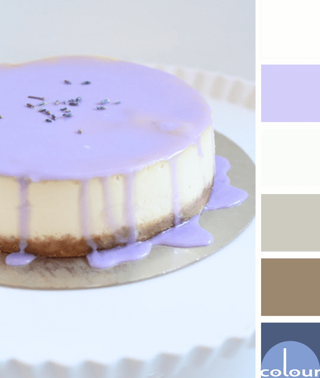
LAVENDER CHEESECAKE
I'm always up for a dessert based color palette. This lavender drizzle makes such a beautiful display for your table but you could also use this palette for other designs. The color lineup for this look is a pale gray, white, periwinkle blue, pewter gray, warm brown and dark blue. The combination is ...
PRIMROSE VISION
I'm a huge fan of color palettes with neutral base tones and small amounts of colorful accents. Using bold, saturated colors sparingly seems to lend more drama to the overall look. And, It's a nice way of adding a playful touch to an otherwise 'safe' room. The 'Primrose Vision' palette uses a creamy ...
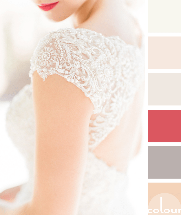
FEARLESSLY FEMININE
My exploration of 'Simply White' has brought me across some truly inspiring design ideas. Here's yet another gorgeous look that features this warm white hue. In this palette, simply white is paired with taupe, rose quartz, light maple, soft peach and a bright pink accent. I call it 'Fearlessly ...
BENJAMIN MOORE SIMPLY WHITE
I can't get enough of white interiors lately. They're just so bright and inviting. Benjamin Moore seems to feel the same way since they made their Color of the Year a beautiful creamy white called 'Simply White'. This gorgeous color is the perfect go-to white with so many great uses. Here are some ...


