What a yummy color palette! The contrast of the cool white tones with the warm browns is just heavenly. Naturally, this enticing photo has me craving a root beer float. Luckily, Melissa over at Bisou / Style has a tasty Chocolate Caramel Stout Float recipe to go with this pretty photograph. And, if ...
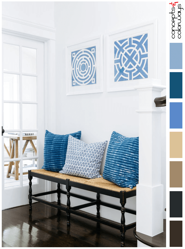
CASUALLY CLASSY
The Casually Classy Palette is a beautiful white interior with dark wood floors and indigo blue accents. This look has a coastal feel to it but in a polished, chic kind of way. There is a relaxed vibe that mixes with the classy style. The key color players in this look are a bright white, indigo ...
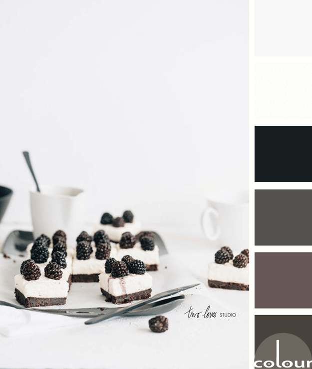
BLACKBERRY CREAM
I like this take on black and white photography by Two Loves Studio. It isn't really a black and white photograph but, instead is a photo of a black and white subject. What I like most about this palette is that it isn't just black and white. Instead, it's a blend of various dark and light colors. ...
OPPOSITES ATTRACT
The 'Opposites Attract' color palette is inspired by a black sesame gelato recipe from Super Nummy. It features the grayish-brown color trend from Sherwin Williams called Sealskin that I showed you here. The rest of the palette is a blood orange, light peach, pale peach, cool gray and cool white. ...
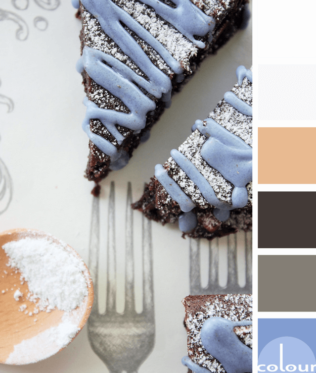
LAVENDER BROWNIES
The 'Lavender Brownies' color palette is a yummy mix of dark brown with lavender blue. The main colors of the look are white and pale gray with a sprinkle of rose beige and metal gray as well. This palette displays the periwinkle color trend quite nicely, don't you think? I'm brewing up some ideas ...


