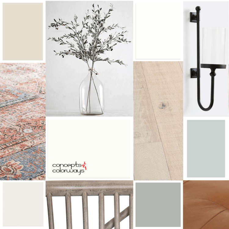
Y'all, I just found my new favorite blue-green paint color! It's perfect for those modern farmhouse looks that we all know and love and it looks great with white walls. In fact, I plan on using this color on the interior side of my front door and it's going to be gorgeous! So, what is this new color ...
OUTDOOR LIVING
I love being outdoors, whether I'm gardening, relaxing on my decking or swimming in my pool. I love getting my dose of fresh air and eat outside whenever I can. It was one of the main reasons I got the above ground pool put in - it would let me find another reason to be outside! There were lots of ...
TRANQUIL VISION
The 'Tranquil Vision' color palette is a gorgeous mix of greens against a creamy beige background. Creamy white, mint green, robin's egg blue, duck egg blue, emerald green, black and creamy beige all come together to create a minty fresh color combo. I love this! Here's a look at the 'Tranquil ...
HAPPY HOUR
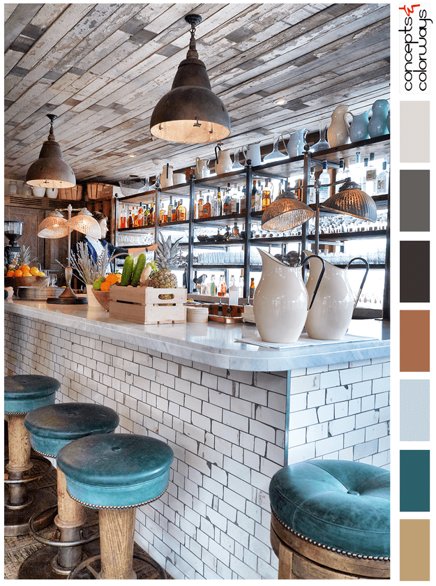
The 'Happy Hour' palette is a chill look with a "put your feet up and stay a while" kind of vibe. This look is all about reclaimed wood, weathered subway tile and dark teal accents. The color palette consists of a light brown, dark teal, pale blue, copper brown, warm black, charcoal gray, pale gray ...
BERGAMO PASSAGE
I'm continuing my exploration of color palettes featuring the burnt orange color trend and this ones a good one. It has a collection of cool blue and gray tones to balance out the rusty warmth of the burnt orange. The complete color lineup is pale blue-gray, dark gray, light warm gray, turquoise ...


