Lively green, indeed! This is a pretty kelly green that is full of life. It's sort of like an emerald green or a jade green. You know, one of those colors that's kind of hard to place. But, those are the best ones, right? This color trend makes a very pretty accent when used sparingly. Especially, ...
PANTONE ARCADIA
Oh, sweet, jade green perfection! This blue-green color has captured a special place in my heart. It's a little hard to describe this exact shade of green. It's kind of a cross between an emerald and a mint. Pantone calls this color Arcadia. And, I'm thrilled that they've chosen it for their Fashion ...
PANTONE ARCADIA
This is about the most beautiful shade of green I've ever laid eyes on. Words can't express just how much I love this color. Lucky for me, it's on the Pantone Fashion Color Trend Report for Spring 2018. That's a sure sign I'll be seeing lots more of this pretty hue in the months to come. Pantone ...
TRANQUIL VISION
The 'Tranquil Vision' color palette is a gorgeous mix of greens against a creamy beige background. Creamy white, mint green, robin's egg blue, duck egg blue, emerald green, black and creamy beige all come together to create a minty fresh color combo. I love this! Here's a look at the 'Tranquil ...
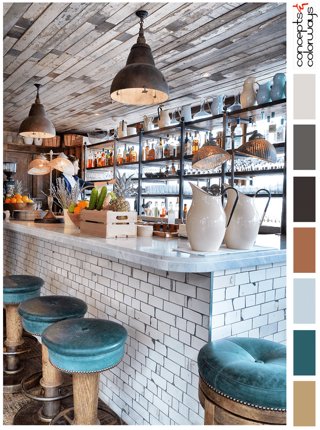
HAPPY HOUR
The 'Happy Hour' palette is a chill look with a "put your feet up and stay a while" kind of vibe. This look is all about reclaimed wood, weathered subway tile and dark teal accents. The color palette consists of a light brown, dark teal, pale blue, copper brown, warm black, charcoal gray, pale gray ...


