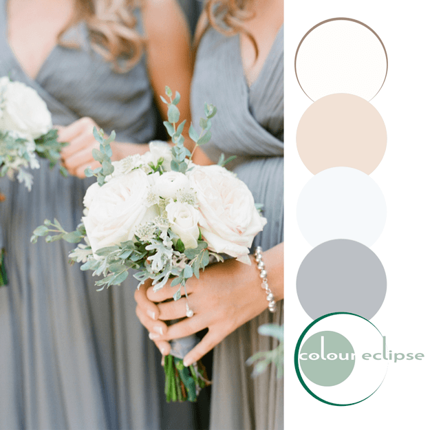
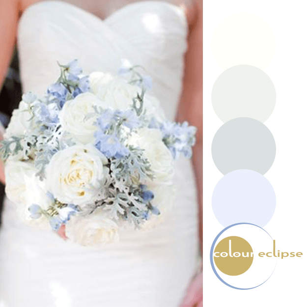
In such a hectic world, I find myself drawn to soothing color palettes like this one. This particular shade of green has really been calling my name. It's one of those colors that's a little hard to place. Is it a seafoam green? ...eucalyptus? ...maybe an aloe green? Whatever you want to call it, it ...
SIMPLE SINCERITY
Okay, this bouquet is gorgeous! I absolutely LOVE the beautiful blue-green tones of the olive leaf contrasted with the white peonies. Add to that the warm whites, pale blush and blue-gray with just a touch of soft pink and this palette is stunning. I can definitely picture this combo in an interior ...
SHERWIN WILLIAMS KIND GREEN
Today's color trend is a pleasing shade of green from the Sherwin Williams 2016 Color Forecast. It's name is Kind Green. A most appropriate name for this approachable blue-green hue. Oh, the things I could do with this lovely color... Like, a mint green sofa. Add one of these beauties to a white, ...
PLANTATION CHARM
I just love neutral color combinations with a feminine touch. Take this palette for example. It's soft and pretty but in a subtle way that doesn't overpower. This look would be perfect for an interior design. Something like this is what I have in mind... Grays are the primary color of this ...
TRANQUIL MOMENT
So, how would you translate this look into an interior design? Here's a little something I put together for this palette... Pendant Light: Nuevo Astra Matte Gold Pendant from Zinc Door Flooring: Alloc Commercial Light Saw Oak Laminate Flooring on Houzz Foliage: Eucalyptus Houseplants ...


