This buttery yellow is a mouthwatering color that's both creamy and bright. Some might call it a lemon or canary yellow. Personally, I think it's a lovely way to add a pop of color to a space. It looks especially good in gray or taupe rooms. If you're looking to add a sunny vibe to your home, this ...
PANTONE ARCADIA
This is about the most beautiful shade of green I've ever laid eyes on. Words can't express just how much I love this color. Lucky for me, it's on the Pantone Fashion Color Trend Report for Spring 2018. That's a sure sign I'll be seeing lots more of this pretty hue in the months to come. Pantone ...
f3b096 | A CREAMY PEACH
It's time for another product roundup folks! This one is for a dreamy pale orange tone I call Creamy Peach. If you're looking for a happy color that's soft and pretty at the same time, this would be a great choice for you. I especially like how this color looks against gray finishes. But, it could ...
A WHITE FARMHOUSE INTERIOR WITH SLATE BLUE RUG AND GREEN PLANTS
I just love the cross between a white farmhouse interior and modern design. There's just something about the crisp, white walls and the rustic wood floors. But, adding in modern pieces and natural accents to the mix makes the look that much better. This home office design is the perfect example of ...
e3ccb3 | A SPUNKY BEIGE
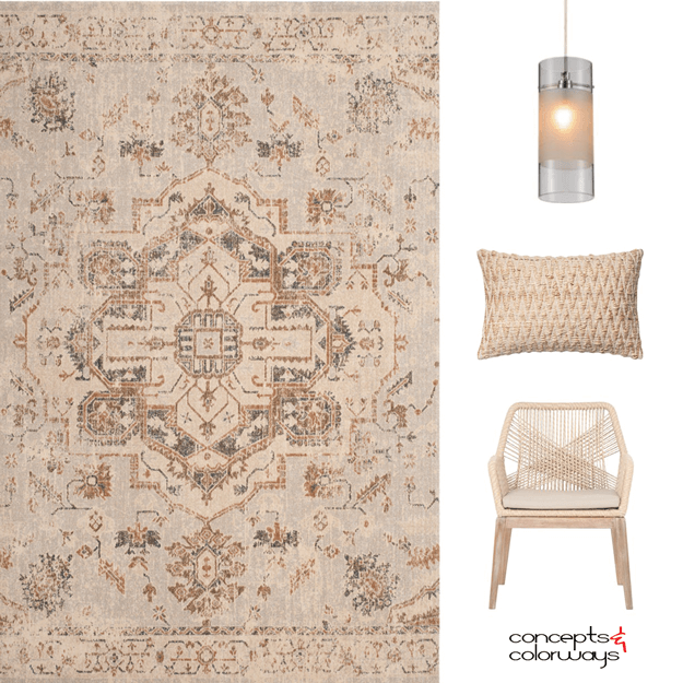
Beige isn't the kind of color people get really excited about. But, it's a necessary neutral to have handy when putting together a great color palette. This color can create a beautiful neutral interior when you pair it with lots of texture and patterns. You can also use this color as a base and ...
- 1
- 2
- 3
- …
- 16
- Next Page »


