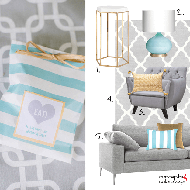
The 'Graphic Vibe' palette translates beautifully into an interior design. What I like best about this look is the largest surfaces and pieces are neutral colors. So, you can inexpensively switch out the accent colors for an entirely different effect. Let's take a closer look at the elements of this ...
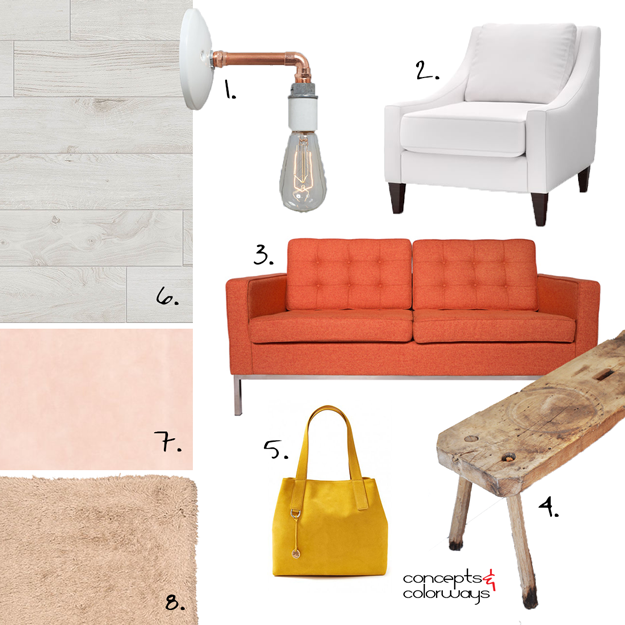
BLUSH SIZZLE
So, how do you create a blush toned interior without it looking too girlie? Or, add burnt orange accents in a room without it feeling like a retro 60's design? Easy. Just include both of these in the same look! Pale grays, whites and rustic wood tones are perfect neutrals to balance out the palette. ...
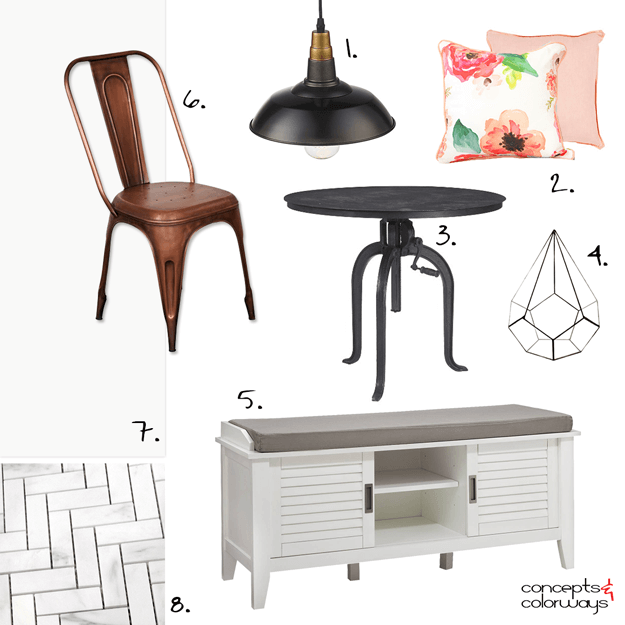
PEACH ALLOY
I'm loving all the lovely blush tone color trends that are so popular right now. They're perfect for adding a feminine touch to a design without being too fru-fru. I've been exploring ways to incorporate these dusty peaches and pinks into my designs. I especially like the 'Peach Alloy' look with ...
FRENCH MINT
No doubt, the French provide an endless supply of design inspiration for us all to enjoy. Their architecture, and entry doors, are especially drool worthy. I think this mint blue door would translate beautifully into an interior design. Only, instead of using this pale blue color on the door, put it ...
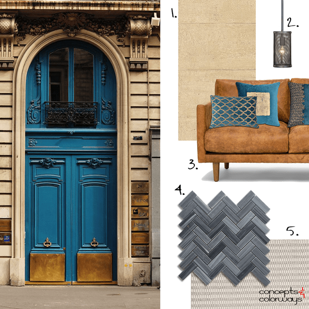
PARIS REFLECTION
I don't typically gravitate towards dark interiors but this one I love!!! The black herringbone tile paired with the warm tan wallpaper. The copper sofa with the peacock blue accent pillows. The warm black pendant lights and the concrete gray area rug. The whole combination comes together to create ...
- « Previous Page
- 1
- …
- 10
- 11
- 12
- 13
- 14
- …
- 16
- Next Page »


