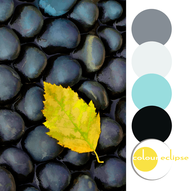
This buttery yellow is a mouthwatering color that's both creamy and bright. Some might call it a lemon or canary yellow. Personally, I think it's a lovely way to add a pop of color to a space. It looks especially good in gray or taupe rooms. If you're looking to add a sunny vibe to your home, this ...
PANTONE MEADOWLARK
Versions of this bright yellow have been popping up on my radar for a while now and I've loved it from the word go! Really, is there anything more cheerful than a sunny, lemon yellow? I'm thrilled to see this color making it's way into interior design and fashion. And, lucky for me, Pantone has ...
METALS & BLUES
Navy and white. It's a classic color combination that has always appealed to me. In fact, this kitchen design is something I would have chosen for myself. It's fresh and cheerful but with the right amount of color accent to keep it fun. What really makes this look work is the color palette. The ...
GINGER CHAMOMILE
So, how would you translate this color palette into an interior design? Here's a little something I put together for this look... Pillow: Chartreuse, Chocolate Brown and Stone Grey Striped Pillow Cover from The Pillow Studio Flooring: Veranda by Daltile in Steel from South Cypress Rug: ...
ON THE ROCKS
So, how would you translate this color palette into an interior design? Here's a little something I put together for this look... Side Table: Black River Stone Side Table from Phillips Collection Wall Paneling: Charcoal Sustainable American Oak Wood Paneling from Stikwood Rug: Surya ...


