I'm continuing my exploration of the Pantone 2017 Spring Fashion Color Report with a creamy light brown called 'Hazelnut'. You could describe this color as light brown, pale brown, caramel brown or camel tan. It has a natural feel to it and adds a warm glow to any interior space. There are so many ...
MOROCCAN TOAST
I would describe this look as warm, cozy and oh so inviting! The warm browns are the perfect balance for the cool teals and sky blue tones. And, the black, silver and light tan accents finish off the look quite nicely. The highlights of this design are the light brown woods, moroccan style patterned ...
MOROCCAN TOAST
Teal blue and copper brown are the primary colors in this Moroccan inspired palette. The rest of the line up is powder blue, silver gray, light tan and hazy white. The combination creates a sense of warmth and comfort that's perfect for inviting interior spaces. I have some ideas brewing for this ...
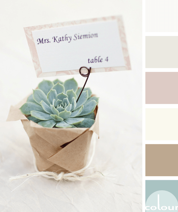
THOUGHTFULLY GIFTED
If you're looking for a refreshing color palette with a relaxing vibe, there's no better inspiration than succulent plants. I've always been a fan of these little guys. They're beautiful yet easy to take care of. The perfect combination! This particular palette is especially nice with it's muted ...
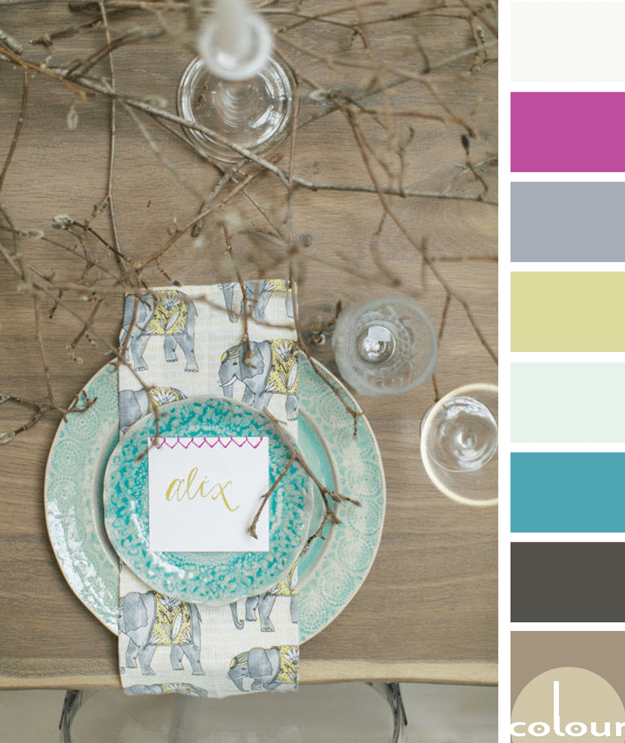
MAGNOLIA FROLIC
I just love rustic designs with a 'pop' of bright color. The 'Magnolia Frolic' palette is all that and more so, naturally, I love it! I'm especially drawn to the turquoise and chartreuse accents with just the slightest touch of hot pink. Lovely! Of course, I had to develop an interior mood board for ...


