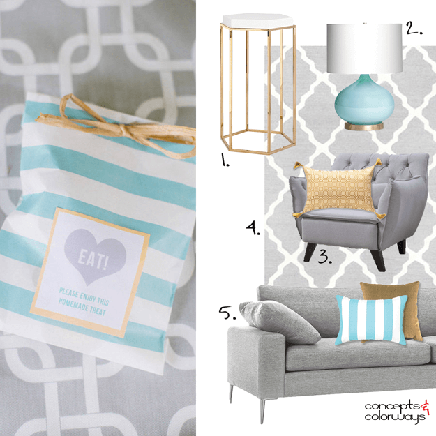
I can't get over how much I love this design! The color palette is just gorgeous, don't you think? This look was inspired by my Turquoise Waters color palette that we looked at on Friday. I wanted to explore this palette further and create a living room mood board showing how these colors could work ...
GRAPHIC VIBE
The 'Graphic Vibe' palette translates beautifully into an interior design. What I like best about this look is the largest surfaces and pieces are neutral colors. So, you can inexpensively switch out the accent colors for an entirely different effect. Let's take a closer look at the elements of this ...


