I'm a huge fan of color palettes with neutral base tones and small amounts of colorful accents. Using bold, saturated colors sparingly seems to lend more drama to the overall look. And, It's a nice way of adding a playful touch to an otherwise 'safe' room. The 'Primrose Vision' palette uses a creamy ...
IVORY DARLING
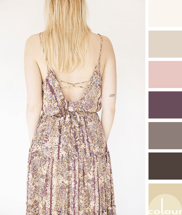
My explorations of 'Poised Taupe' have led me to this incredible summer dress and oh, what a color palette it creates! The combination of taupe, bronze, plum, dusty rose, blonde yellow and putty white are heavenly. My mind is racing with so many design ideas for this beautiful palette. What does the ...
BENJAMIN MOORE SIMPLY WHITE
I can't get enough of white interiors lately. They're just so bright and inviting. Benjamin Moore seems to feel the same way since they made their Color of the Year a beautiful creamy white called 'Simply White'. This gorgeous color is the perfect go-to white with so many great uses. Here are some ...
CLASSICAL DENIM
This bedroom is the perfect balance of classic and casual. I love how the denim blue accents contrast with the antique white walls and the pop of black and brass accent is just perfect. The color palette is simple yet full of life. I could definitely see myself living here. So, how do you create ...


