It's probably no secret that I love white interiors with bold pops of color. I'm gushing over these types of designs all the time and this bedroom is no exception. I love it! It's youthful and fun. The color palette is really what makes this look work so, let's have a closer look at what's going on ...
GRAPHIC VIBE
The 'Graphic Vibe' palette translates beautifully into an interior design. What I like best about this look is the largest surfaces and pieces are neutral colors. So, you can inexpensively switch out the accent colors for an entirely different effect. Let's take a closer look at the elements of this ...
GRAPHIC VIBE
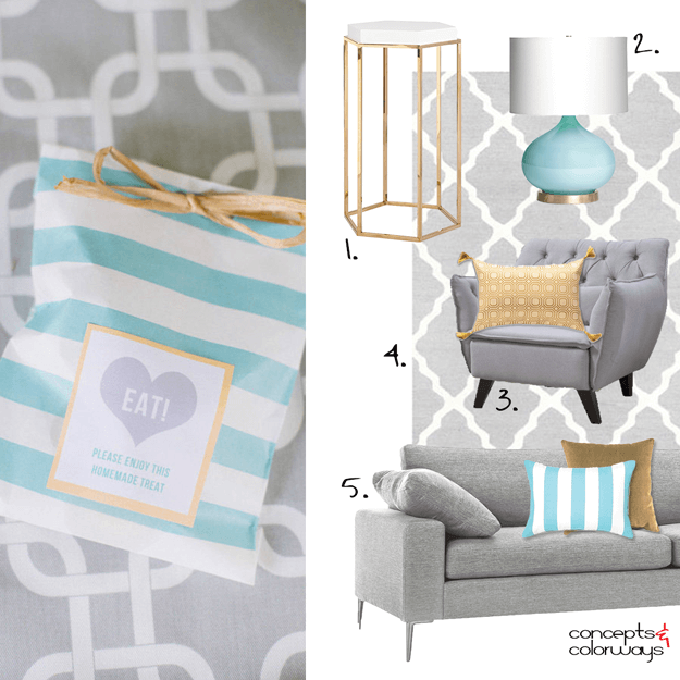
So many pretty colors bundled in one gorgeous combination. This palette is definitely a keeper! The star player of this look is a beautiful light turquoise, paired with white, in a bold, modern stripe. This I love. The remainder of the lineup is a straw yellow, copper brown, lilac gray and warm ...
FROSTED COLOR INTENSITY
ARTFULLY ARRANGED HUES
- « Previous Page
- 1
- …
- 4
- 5
- 6
- 7
- 8
- …
- 16
- Next Page »


