
I'm totally loving this purple and green color combination. Especially against a white backdrop. The soft beige tones, copper and slate blue tones add interest while maintaining harmony in the look. This color palette would make a beautiful interior design. Don't you think? Coordinating posts ...
COPPER POP
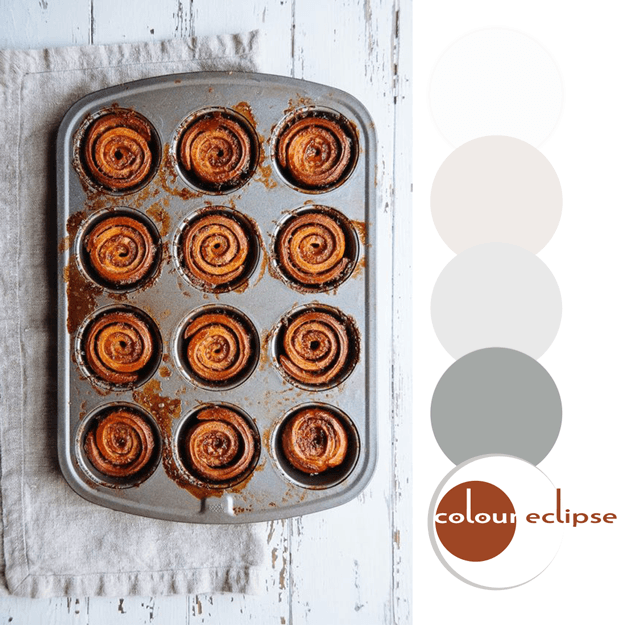
Mmm...sticky buns! They look delicious and are a great inspiration for an interior design. Metals, linens and white distressed woods with a pop of copper orange. I can just picture the space now.The walls would be a white washed ship lap wood with a feature wall of stainless steel mosaic tiles. ...
PANTONE POTTER’S CLAY

Introducing, today's Color Trend: Potter's Clay! More specifically, Pantone 18-1340. Today's color was selected from the Pantone Fashion Color Report Fall 2016. Or, add it to a white room as accents for a brighter look. 'Potter's Clay' is the perfect color to go for when working with ...