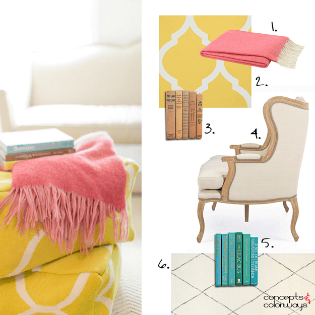
Yesterday, we explored the 'Primrose Vision' color palette but, how do you create an interior design in this look? Let's go over the individual elements that make up this design. You'll want to start with an ivory colored rug or carpet. I chose one with a very subtle diamond pinstripe for a little ...
PRIMROSE VISION
I'm a huge fan of color palettes with neutral base tones and small amounts of colorful accents. Using bold, saturated colors sparingly seems to lend more drama to the overall look. And, It's a nice way of adding a playful touch to an otherwise 'safe' room. The 'Primrose Vision' palette uses a creamy ...
PANTONE PRIMROSE YELLOW
Oh...yellow. It adds brightness and cheer in a way no other color can do. Strategically placed in interiors as accents, it can really make magic happen. I especially like the bright tones of this color such as the 2017 color trend, Primrose Yellow by Pantone. This sunny hue looks best in white and ...


