The 'Katara Medallion' palette revolves around a gorgeous turquoise blue. The full color palette is a dark navy, turquoise blue, sage gray, creamy ivory, brassy brown, warm beige and avocado green. This look is bright and fresh with a tranquil vibe. Here's a look at the 'Katara Medallion' paint ...
PANTONE SHADED SPRUCE
One glimpse of this color and my stress levels instantly drop. It's a soothing shade of blue-green that Pantone calls 'Shaded Spruce'. It's part of their 2017 Fall Fashion Color Report for New York. I have a feeling this one will be especially popular. I've already seen a lot of love for a similar ...
COASTAL COZINESS
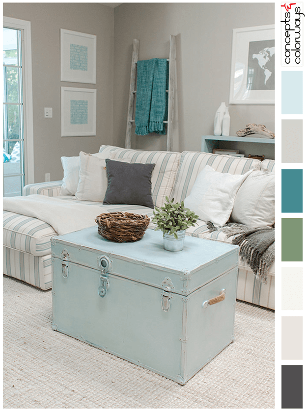
Mint blue is such a refreshing color. Just perfect for coastal style interiors. This pale blue color fits well in many different combinations. I especially like the color palette of this living room by Jenna Sue Design Co. The color roundup consists of warm gray, teal green, moss green, creamy ...
PARIS REFLECTION
The copper brown and teal blue combo is really catching my eye lately. Take these Parisian doors, for instance. The depth of the copper and peacock blue doors contrasts beautifully with the light tan stone of the building. And, the black and gray accents add even more interest to the look. The ...
MOROCCAN TOAST
Teal blue and copper brown are the primary colors in this Moroccan inspired palette. The rest of the line up is powder blue, silver gray, light tan and hazy white. The combination creates a sense of warmth and comfort that's perfect for inviting interior spaces. I have some ideas brewing for this ...


