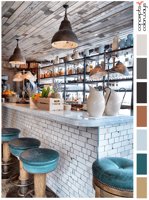
The 'Happy Hour' palette is a chill look with a "put your feet up and stay a while" kind of vibe. This look is all about reclaimed wood, weathered subway tile and dark teal accents. The color palette consists of a light brown, dark teal, pale blue, copper brown, warm black, charcoal gray, pale gray ...
TEAL GRANDEUR
When it comes to inspiring architecture, Paris can really deliver. Every time I turn around, I'm finding another beautiful entry door that was photographed in the city of love. This dark teal entry door is my latest obsession. The contrast of the dark green against the light tan is just gorgeous. ...
PANTONE SHADED SPRUCE
One glimpse of this color and my stress levels instantly drop. It's a soothing shade of blue-green that Pantone calls 'Shaded Spruce'. It's part of their 2017 Fall Fashion Color Report for New York. I have a feeling this one will be especially popular. I've already seen a lot of love for a similar ...
THOUGHTFULLY GIFTED
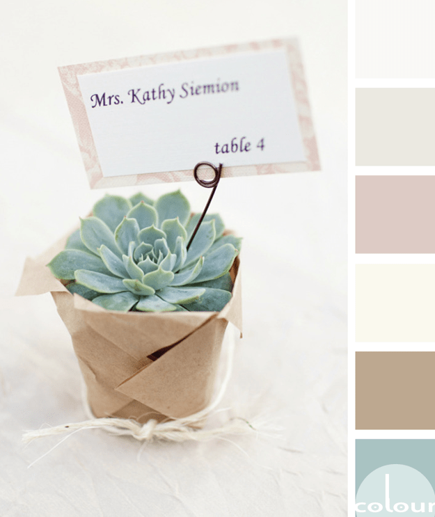
If you're looking for a refreshing color palette with a relaxing vibe, there's no better inspiration than succulent plants. I've always been a fan of these little guys. They're beautiful yet easy to take care of. The perfect combination! This particular palette is especially nice with it's muted ...


