So many pretty colors bundled in one gorgeous combination. This palette is definitely a keeper! The star player of this look is a beautiful light turquoise, paired with white, in a bold, modern stripe. This I love. The remainder of the lineup is a straw yellow, copper brown, lilac gray and warm ...
PRIMROSE VISION
I'm a huge fan of color palettes with neutral base tones and small amounts of colorful accents. Using bold, saturated colors sparingly seems to lend more drama to the overall look. And, It's a nice way of adding a playful touch to an otherwise 'safe' room. The 'Primrose Vision' palette uses a creamy ...
PEACH COLOR POP
This look reminds me of those black and white photos with one object in color. I've always loved those. So much drama! This effect can easily be recreated in an interior design with a palette of grays, blacks and whites with just one color accent in the room. In this case, a beautiful blush peach ...
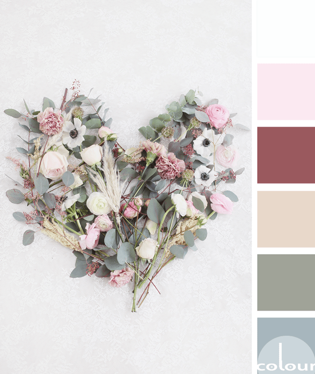
FLORAL AFFECTION
I'm continuing my exploration of olive gray color palettes with this beautiful floral inspired look. The olive tones are paired with a collection of blue-gray, soft beige, burgundy, soft pink and cool white. The combination has a nice complexity to it but in a soft, tranquil sort of way. What do ...
URBAN OLIVE GROVE
This palette is neutral to the point of almost being black and white. But, if you look closely you see subtle color variation that adds a spark of life to this urban look. The primary accent color is a lovely olive gray with the remainder of the lineup being a charcoal black, industrial gray, ...
- « Previous Page
- 1
- …
- 5
- 6
- 7
- 8
- 9
- …
- 11
- Next Page »


