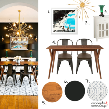
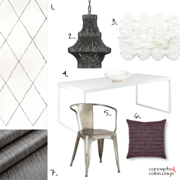
Yesterday, I showed you the ‘Dramatic Flair’ palette with all it’s mystery and charm. So today, I wanted to take a closer look at this space and break it down into it’s design elements for…
Color and Interior Design Inspiration Blog
Yesterday, I showed you the ‘Dramatic Flair’ palette with all it’s mystery and charm. So today, I wanted to take a closer look at this space and break it down into it’s design elements for…
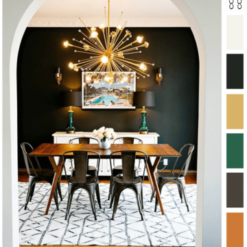
The ‘Dramatic Flair’ palette is a dark one with small amounts of white accent. It’s great for eclectic style interiors, industrial modern styles and anywhere you want a dramatic flair. The color line-up includes a…
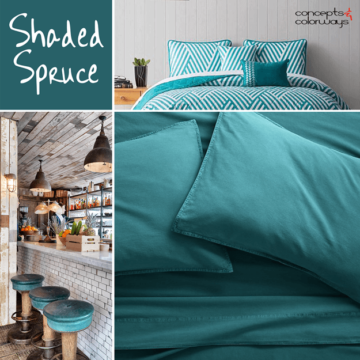
One glimpse of this color and my stress levels instantly drop. It’s a soothing shade of blue-green that Pantone calls ‘Shaded Spruce’. It’s part of their 2017 Fall Fashion Color Report for New York. I…

Hi everyone, Bobbi here with a brand new design element that’s a personal favorite…White Sheepskin Throws! These little babies are so versatile. You can use them as rugs or drape them over a chair for…
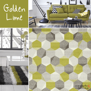
Today’s color trend is a fun lime green tone with a strong vintage vibe. Some might call it a chartreuse. Pantone calls it ‘Golden Lime’ and they’ve included it in their Fashion Color Report for…
The ‘Blackberry Cream’ look is a simple black and white interior that’s perfect for modern spaces. You’ll start out with a white room for this look and layer a white trellis patterned rug and metallic…
Copyright © 2026 Concepts and Colorways · Theme by 17th Avenue
