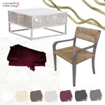
The ‘Burgundy Sprout’ color palette is inspired by this gorgeous photograph by Frida Ramstedt of Trendenser. When I first saw this image, the dark burgundy plant was the first thing to catch my eye. But, then I noticed the lovely texture of the concrete pot and the adorable modern wood bird figurines. I must have one of these! I found a similar one at France & Son and another one at Danish Design Store.
This palette is created mostly with concrete gray tones and a hazy white. Accents of burgundy, muted brown and light celery yellow complete the look. I have some ideas brewing about translating this color combo into an interior design. I’ll be posting a mood board shortly so stay tuned!
Until then, here’s a look at the ‘Burgundy Sprout’ paint palette to spark more design inspiration…

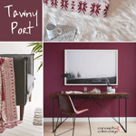
If you like this look, you might also like my Tawny Port color trend post.