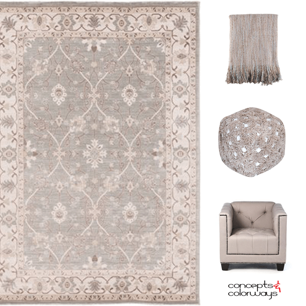
Today's color is not for the light of heart. It's called Pantone Ultra Violet for a reason folks and you'll need to be brave to tackle this brazen hue. If you're a fan of purple home decor, this just might be the interior accent for you. Ultra Violet has been selected as the 2018 Pantone color of ...
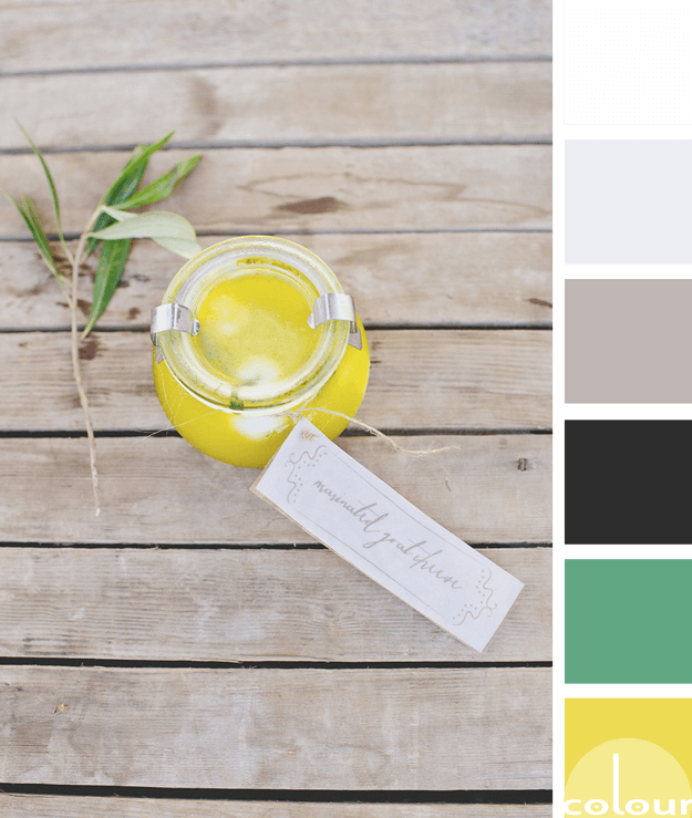
61a783 | A LIVELY GREEN
Lively green, indeed! This is a pretty kelly green that is full of life. It's sort of like an emerald green or a jade green. You know, one of those colors that's kind of hard to place. But, those are the best ones, right? This color trend makes a very pretty accent when used sparingly. Especially, ...
ebeef4 | A DELICATE BLUE
This color is like a breath of fresh air. It's a pale blue-gray that I would describe as a delicate blue. There's something very soothing about the subtlety of this blue. It's a whisper of sky blue that adds a heavenly touch to any interior design. I especially like how this hue looks with warm gray ...
c0b6b4 | A BLUSHING TAUPE
Taupe is such a great go-to neutral to use when putting together your interior color palette. It tends to be associated with traditional spaces. But, don't overlook taupe when working with modern looks. When paired with the right companion colors, taupe can fit in perfectly with more trendy ...
RUSTIC BRILLIANCE
There's something about a bright yellow that just brightens up my day. It's about the happiest, most cheerful color I believe I've ever met. Pantone has included this particular shade of yellow in their Fashion Color Trend Report for Spring 2018. They call it Meadowlark. So, naturally I wanted to ...
- 1
- 2
- 3
- …
- 24
- Next Page »


