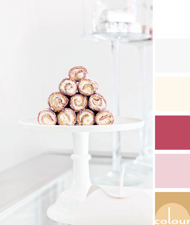
I have a confession to make. I am obsessed with food photography! And, there's nothing more inspiring to me than a mouth-watering dessert photograph. Take these yummy cake rolls, for instance. There are so many pretty colors you can draw from them for a beautiful paint palette. I see golden brown ...
SHERWIN WILLIAMS REFLECTING POOL

Turquoise has really been a crowd favorite lately. And I, for one, am thrilled! I've loved this pretty little blue-green color since way before it was a trend. Now, it's being recognized by the masses for it's sheer awesomeness. In fact, Sherwin Williams has a version of turquoise they call ...
A PALE PINK INTERIOR WITH NAVY, HOT PINK AND GREEN ACCENTS
Yesterday, I showed you the Blush Harmony color palette that inspired this pale pink interior design. The barely pink bridesmaid's dresses are what attracted me to this image. . And, it translates beautifully into a wall paint and sofa upholstery, don't you think? The combination of this pale pink ...
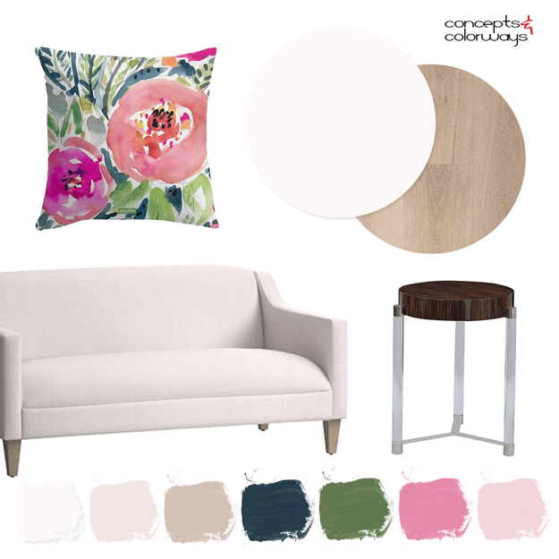
BLUSH HARMONY

The 'Blush Harmony' palette is the perfect example of how to accent blush pink for a feminine, on-trend look. The interplay of colors in this photograph really draw me in and make me wish I were there. At the wedding. Taking in all the beautiful colors. The palest of pink bridesmaid's dresses make a ...
A WHITE BEDROOM WITH BLUSH PINK AND LIGHT WOODS

Oh my! A white bedroom with blush pink and light woods. The pretty colors in this room are a feast for my eyeballs. I showed you the color palette for this design on Monday in my Brilliantly Cozy palettes by project post. Today, I want to take a closer look at the design elements that make up this ...
- « Previous Page
- 1
- …
- 25
- 26
- 27
- 28
- 29
- …
- 119
- Next Page »
