
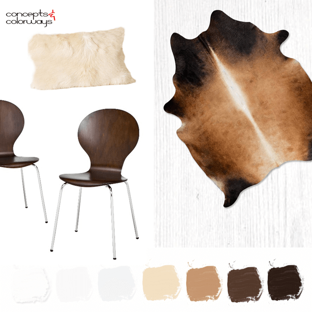
Sometimes, it's the simple color palettes that make the biggest impact. Take the 'Winter Oak' palette for example. This color combo is a basic mix of white, cool gray, beige, caramel brown, dark brown with just a touch of black undertones. I think the contrast between the mostly white room with the ...
A WHITE INTERIOR WITH CHOCOLATE BROWN, CARAMEL AND CREAM ACCENTS
I woke up this morning with a new idea for the blog. A new category actually that I'm going to call Interior Color Palettes. I've been stuck for a while on how to explore the new color palettes that I develop from an interior design perspective. And, I think this solution just might do the trick. My ...
CHOCOLATE, CARAMEL AND CREAM

What a yummy color palette! The contrast of the cool white tones with the warm browns is just heavenly. Naturally, this enticing photo has me craving a root beer float. Luckily, Melissa over at Bisou / Style has a tasty Chocolate Caramel Stout Float recipe to go with this pretty photograph. And, if ...
PANTONE NEUTRAL GRAY
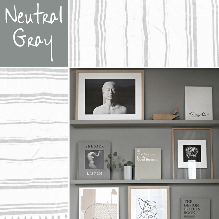
It always amazes me how the right shade of gray can make a design so darn pretty. I mean, gray is about as neutral and bland as you can get right? So, how can it literally transform a space from a dull room to a showpiece? One particular shade of gray that really catches my eye is Pantone's Neutral ...
METALS & BLUES

Yesterday, we looked at the Metals & Blues color palette with that gorgeous navy and white combo that I love. Today, I want to take a closer look at the materials and furnishings that make up this look. The designer used the navy blue accent in the cabinets and window shade which contrasts well ...
- « Previous Page
- 1
- …
- 29
- 30
- 31
- 32
- 33
- …
- 119
- Next Page »
