
Would you say this color is a periwinkle blue? I think that best describes it. Or, maybe you would say it's a lavender blue? Sherwin Williams calls it Dahlia and it certainly is a soothing color. it's part of their 2017 Color Forecast in the Intrepid collection. This isn't a color I've seen a lot of ...
NATURALLY BOLD

Now, here's a play room with some style! It's playful enough for kids to love it but in a contemporary way that appeals to adults as well. The foundation of the look is a warm toned color palette with a bold pop of black accents. The walls of the room will be white with a natural fiber rug in a ...
NATURALLY BOLD
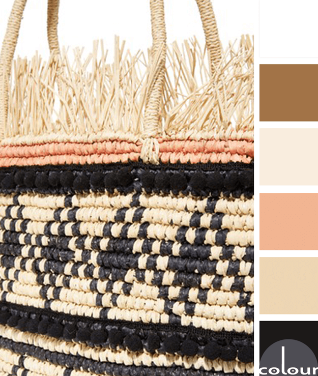
Natural warm tones with some high contrast black accents. Now, that's what I'm talking about! This look is given a softer touch with the pale peach details. I like that this color palette is warm, natural, pretty and bold all at the same time. I can picture this combination being used in so many ...
LAPIS WHITEOUT

Have you ever looked at a beautiful front door and wondered what was on the other side of it? I do this all the time. It's just how my 'designer' brain works. When I look at this gorgeous bright blue door I imagine what the entry interior is like. White walls, maybe a classic subway tile with a ...
LAPIS WHITEOUT

I am obsessed with this shade of blue! There are many names for it: royal blue, cobalt, sapphire, and sometimes just bright blue. Pantone calls it 'Lapis Blue'. Whatever the name, it's a gorgeous focal point in this stunning color palette. I especially like this shade of blue in a mostly white ...
- « Previous Page
- 1
- …
- 46
- 47
- 48
- 49
- 50
- …
- 119
- Next Page »
