There's just something about a modern interior with concrete details that I absolutely love. Especially when the concrete has a weathered look to it. When working with concrete, I like to add some natural elements to balance the look. For this design I went with a woven fiber chair, a fringed ...
BURGUNDY SPROUT
The 'Burgundy Sprout' color palette is inspired by this gorgeous photograph by Frida Ramstedt of Trendenser. When I first saw this image, the dark burgundy plant was the first thing to catch my eye. But, then I noticed the lovely texture of the concrete pot and the adorable modern wood bird ...
PANTONE TAWNY PORT
What a refreshing shade of red. It reminds me of a cozy winter day and it is oh, so classy. Pantone calls this hue 'Tawny Port'. They've included it in their Fashion Color Report for this coming fall and I'm giddy just thinking about it. I can already picture the beautiful Christmas decorations I ...
SIENNA BLUSH
The 'Sienna Blush' palette is a soft look featuring blush pink and ivory as the base of the design. The complete color set is a burgundy red, avocado green, eucalyptus green, gray-brown, dreamy white, dusty rose and ivory. This look adds a delicate touch to a design and is perfect for creating ...
FLORAL AFFECTION
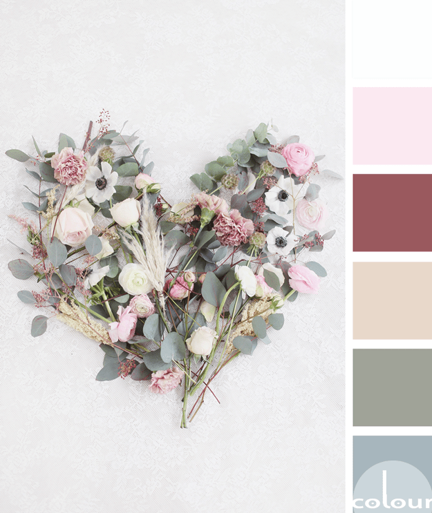
I'm continuing my exploration of olive gray color palettes with this beautiful floral inspired look. The olive tones are paired with a collection of blue-gray, soft beige, burgundy, soft pink and cool white. The combination has a nice complexity to it but in a soft, tranquil sort of way. What do ...


