
I'm a huge fan of color palettes with neutral base tones and small amounts of colorful accents. Using bold, saturated colors sparingly seems to lend more drama to the overall look. And, It's a nice way of adding a playful touch to an otherwise 'safe' room. The 'Primrose Vision' palette uses a creamy ...
SHIBORI BLEND
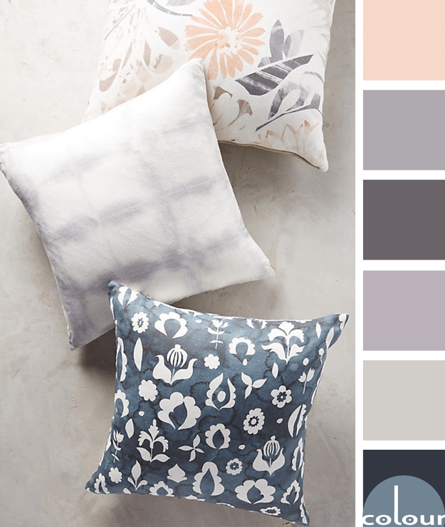
I just love the textures and patterns that Anthropologie comes up with. This pillow combination is a perfect example. The patterns are fantastic and the color palette...just gorgeous! The majority of the palette consists of soothing cool tones of navy blues and lilac grays with a warm base color of ...
PASTEL VISION
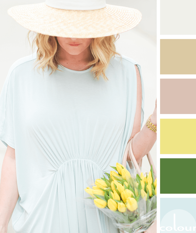
Today's palette is for the pastel lovers out there. If mint blues, canary yellows and spring greens really make you swoon, this might be the palette for you! I love the bold combination of bright colors mixed with a selection of more grounding, neutrals. The putty white, light brown and blush rose ...
FRENCH MINT

Today's inspiration is a gorgeous door image from one of my favorite photographers, Georgianna Lane. I love the soothing color palette it creates. The mint blue doors, light stone walls and purplish-gray pavers blend beautifully together. And, the subtle accents of taupe, navy blue and moss green ...
PARIS REFLECTION
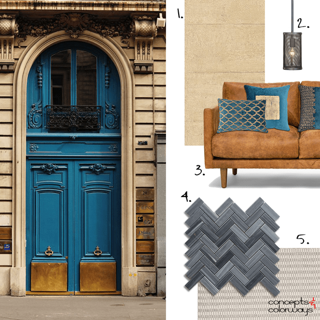
I don't typically gravitate towards dark interiors but this one I love!!! The black herringbone tile paired with the warm tan wallpaper. The copper sofa with the peacock blue accent pillows. The warm black pendant lights and the concrete gray area rug. The whole combination comes together to create ...
- « Previous Page
- 1
- …
- 5
- 6
- 7
- 8
- 9
- …
- 31
- Next Page »