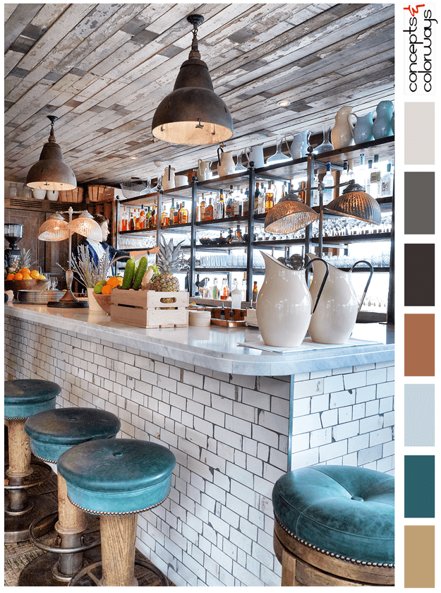
The 'Happy Hour' palette is a chill look with a "put your feet up and stay a while" kind of vibe. This look is all about reclaimed wood, weathered subway tile and dark teal accents. The color palette consists of a light brown, dark teal, pale blue, copper brown, warm black, charcoal gray, pale gray ...
MAGICAL THINKING

The 'Magical Thinking' palette is a soft ivory look with harmonious accents in a blue-black, plum and copper brown. This palette has layers of light tones such as blush beige, ivory, vintage white and blue-gray. The whole combination comes together with a spunky vibe yet oh so relaxing. I love ...
PANTONE BUTTERUM
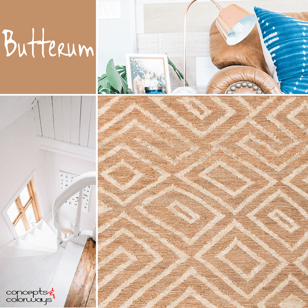
Mmm...Butterum. This color trend looks as yummy as it sounds. I've been particularly smitten with this particular shade of light brown for some time now, especially in leather pieces. I even have a pair of riding boots in this shade that I wear all winter long. Pantone has included 'Butterum' in ...
BLUSHING FACADE
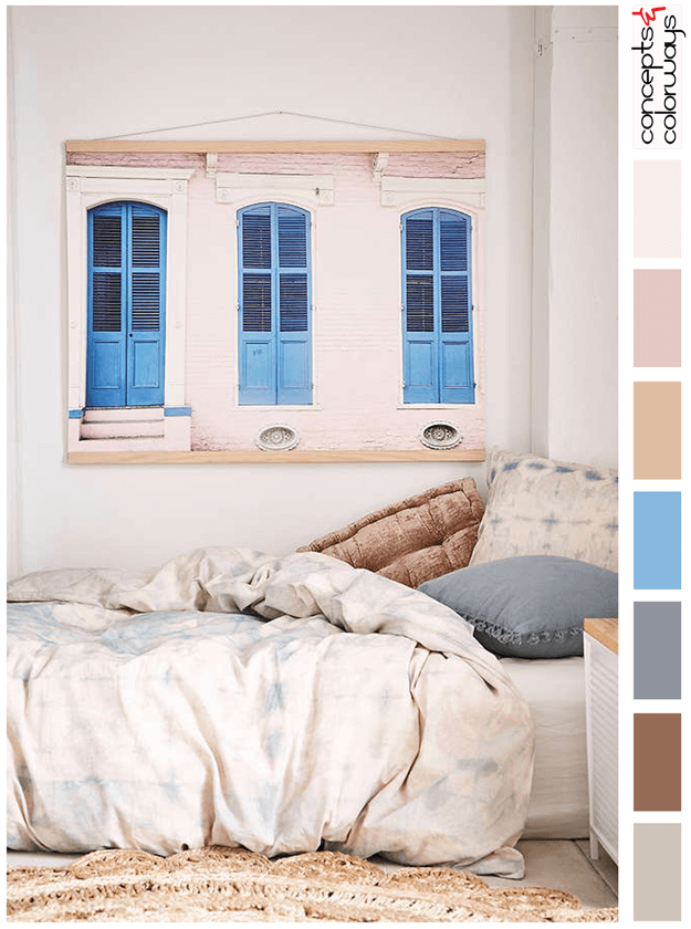
The 'Blushing Facade' palette is a playful combination of blush tones with a bright french blue for accent. The full color collection is a warm taupe, russet brown, steel gray, bright french blue, blush beige, dusty pink, and pale pink and pinkish-white. This is a colorful combo inspired by a photo ...
SUNNY TAPESTRY

The 'Sunny Tapestry' palette is a perfectly balanced palette of light taupes with a bold sunny yellow accent. The contrast between the neutral taupe tones of the room and the bold yellow details are just gorgeous. The full-color lineup is a taupe gray, warm beige, copper brown, pale gray, dark gray, ...