
Wedding bouquets are often the subject of my color palette inspiration. This one really caught my eye because of it's unique color combination. I never would have considered using this group of colors together but the result is surprisingly pretty. The dark steel gray dress in the background is the ...
HAPPY HOUR
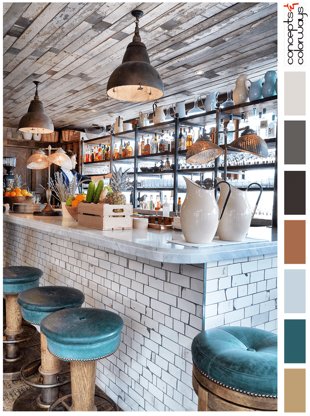
The 'Happy Hour' palette is a chill look with a "put your feet up and stay a while" kind of vibe. This look is all about reclaimed wood, weathered subway tile and dark teal accents. The color palette consists of a light brown, dark teal, pale blue, copper brown, warm black, charcoal gray, pale gray ...
SUNNY TAPESTRY

The 'Sunny Tapestry' palette is a perfectly balanced palette of light taupes with a bold sunny yellow accent. The contrast between the neutral taupe tones of the room and the bold yellow details are just gorgeous. The full-color lineup is a taupe gray, warm beige, copper brown, pale gray, dark gray, ...
TEAL GRANDEUR

When it comes to inspiring architecture, Paris can really deliver. Every time I turn around, I'm finding another beautiful entry door that was photographed in the city of love. This dark teal entry door is my latest obsession. The contrast of the dark green against the light tan is just gorgeous. ...
BLACKBERRY CREAM
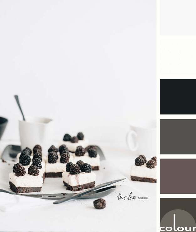
I like this take on black and white photography by Two Loves Studio. It isn't really a black and white photograph but, instead is a photo of a black and white subject. What I like most about this palette is that it isn't just black and white. Instead, it's a blend of various dark and light colors. ...