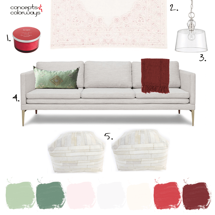
Red and green. It can throw off a strong 'Christmas' vibe, can't it? But, it can also be more timeless when done right. The key is in the other colors you use in the palette and the particular shades of red and green that you use. Take this living room design, for example. This would work great ...
A Color Palette Inspired by Pink and Red Flowers with Mint Green Accents
I don't usually work with pink and red together. But after seeing this color palette, I'm starting to reconsider. It's another gorgeous combination inspired by floral arrangements and it's totally stealing my heart at the moment. The photo was taken by a talented wedding photographer named Sarah ...
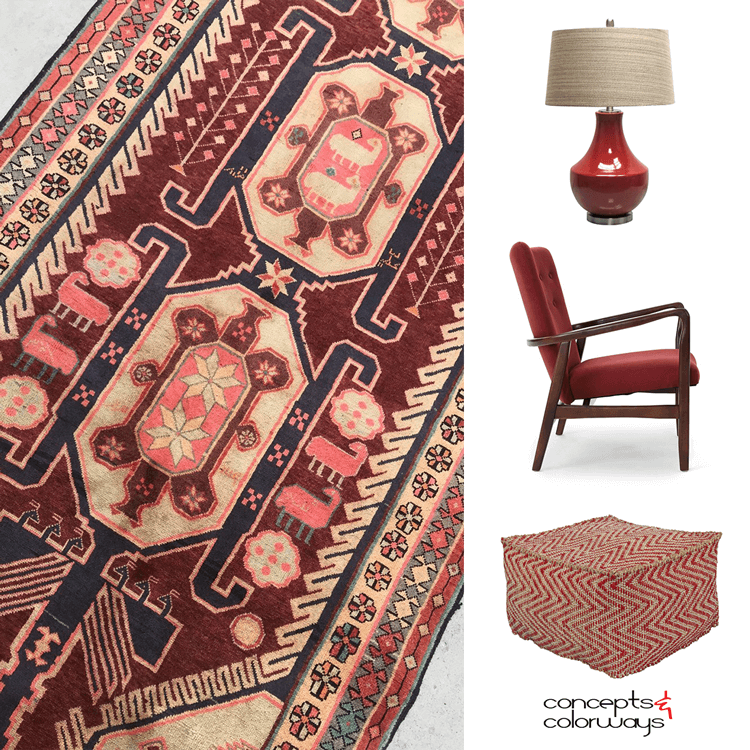
PANTONE SPICED APPLE
We're nearing the end of the Pantone Spring Color Trends for 2018. I have one more to show you after this one and that's it. But, don't worry, Pantone has a whole new collection of colors for us to explore for Fall 2018. I'm looking forward to getting started with those soon. But, for now, let's ...
NATURAL INSPIRATION
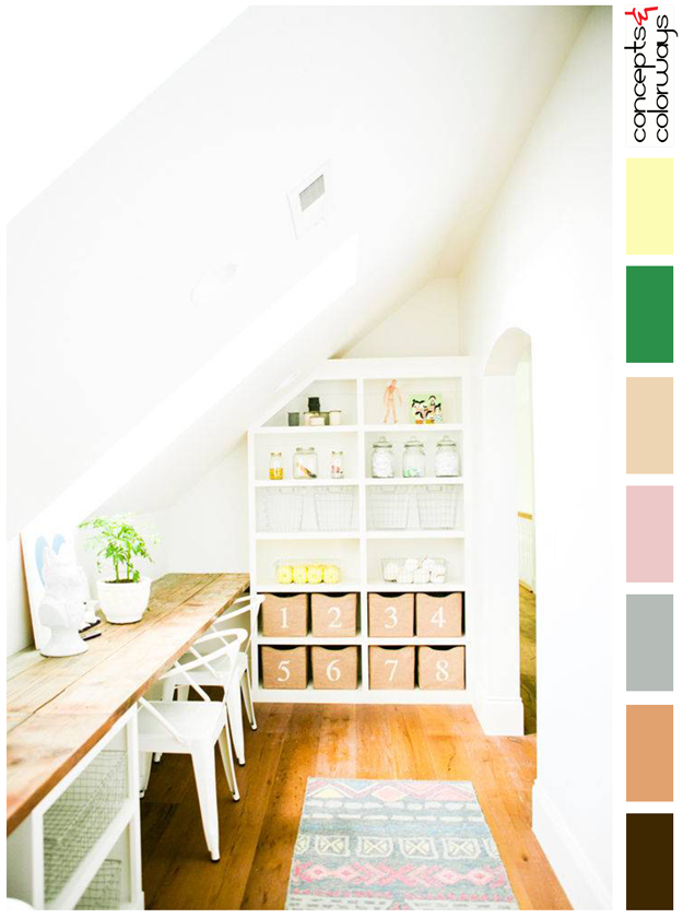
The 'Natural Inspiration' palette is set in a creamy white base with a foundation of natural wood tones in beige and copper brown. Small amounts of colorful accents are used in bright green, canary yellow, blush pink and warm gray. A dark brownish-black wood grain adds just the slightest amount of ...


