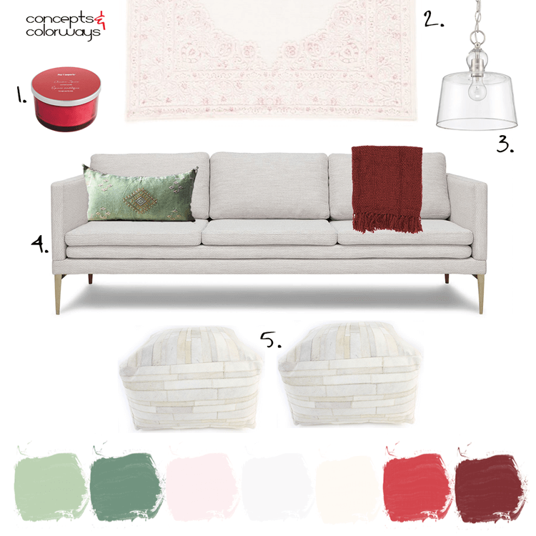
Red and green. It can throw off a strong 'Christmas' vibe, can't it? But, it can also be more timeless when done right. The key is in the other colors you use in the palette and the particular shades of red and green that you use. Take this living room design, for example. This would work great ...
A Color Palette Inspired by Pink and Red Flowers with Mint Green Accents
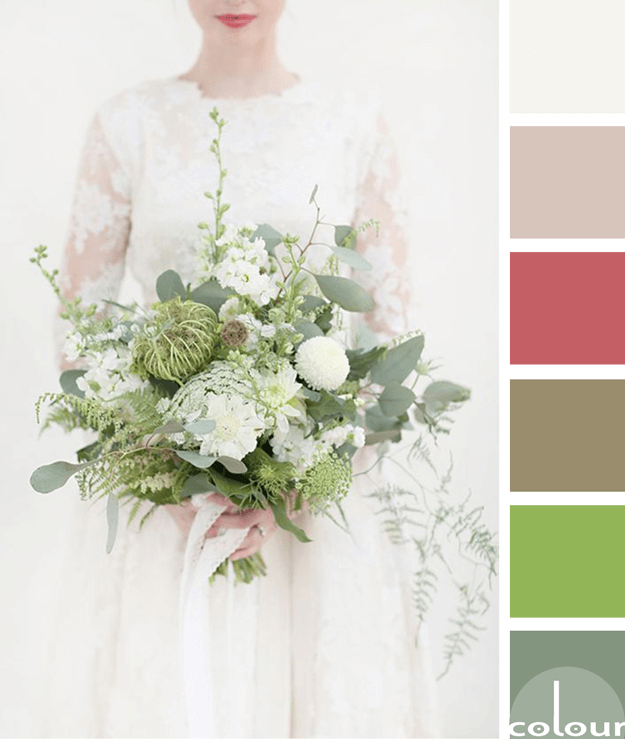
I don't usually work with pink and red together. But after seeing this color palette, I'm starting to reconsider. It's another gorgeous combination inspired by floral arrangements and it's totally stealing my heart at the moment. The photo was taken by a talented wedding photographer named Sarah ...
NATURE’S BOUQUET
Beautiful, lush and green. The 'Nature's Bouquet' palette is a simple ivory white with accents in eucalyptus green, lime green, muted brown, faded red and taupe beige. It inspires me to create something new with a vintage feel to it. Something with some lace maybe? Definitely, some green plants ...
SIENNA LACE
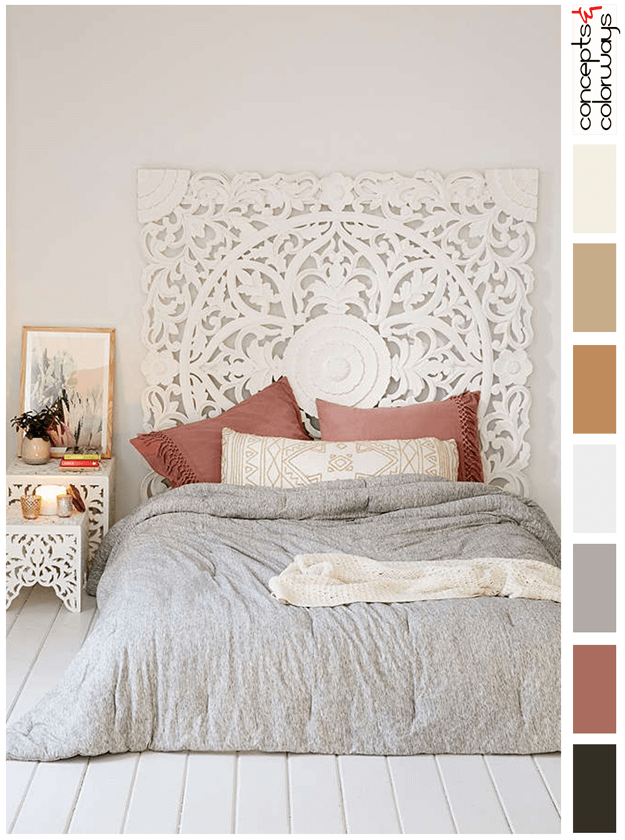
The 'Sienna Lace' palette is a soft ivory look with warm gray and dusty pink accents. Smaller touches of light gold and black are also used to balance the design. The complete color lineup is an ink black, dusty rose, warm gray, pale gray, warm gold, light gold, ivory and warm white. This palette is ...
PANTONE DUSTY CEDAR
Introducing, today's Color Trend: Dusty Cedar! More specifically, Pantone 18-1630. Today's color was selected from the Pantone Fashion Color Report Fall 2016. But, it also looks perfectly at home in a classic, country inspired space. 'Dusty Cedar' is reminiscent of an old red barn and pops ...


