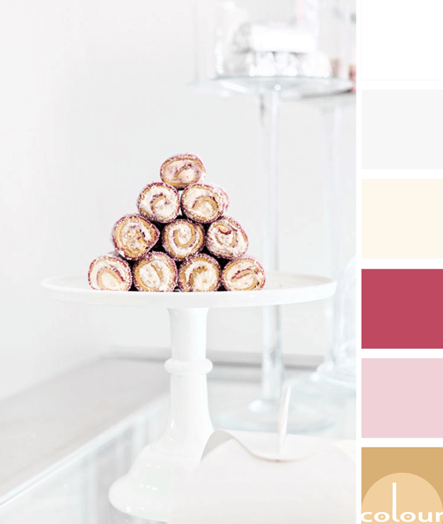
I have a confession to make. I am obsessed with food photography! And, there's nothing more inspiring to me than a mouth-watering dessert photograph. Take these yummy cake rolls, for instance. There are so many pretty colors you can draw from them for a beautiful paint palette. I see golden brown ...
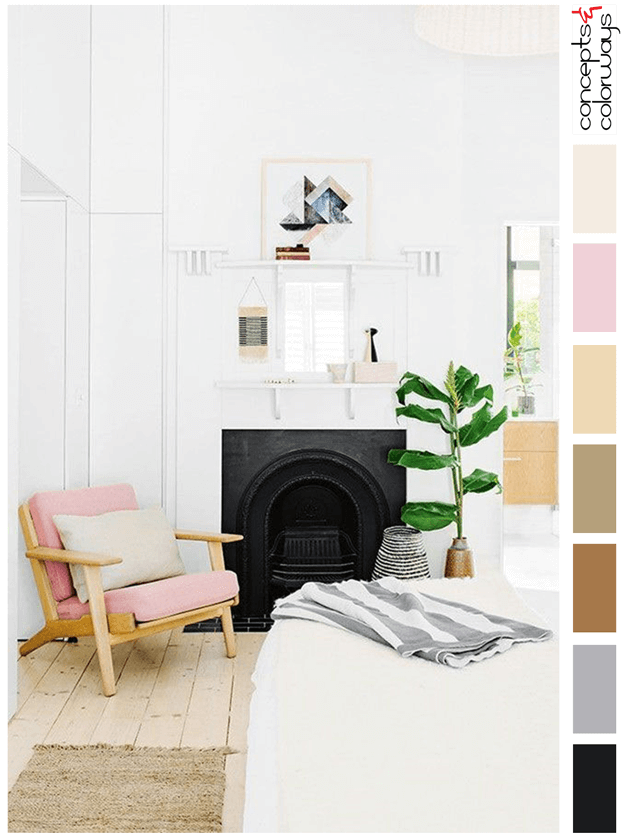
BRILLIANTLY COZY
My best description of this bedroom color palette would be 'Brilliantly Cozy'. It's pushing all my 'YES!' buttons with it's dreamy white walls and trim. Then, the beautiful arrangement of accent pieces came along and sealed the deal for me. I mean, just look at that blush pink upholstered chair! The ...
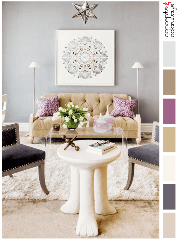
ECLECTIC SYMMETRY
This color palette is just gorgeous! I love the combination of blush sand, dark lilac gray, ivory, camel tan, plum, light brown and soft gray. This look is soothing yet full of life. It has a sophisticated quality that is great for formal spaces yet is playful with whimsical pieces. A perfect ...
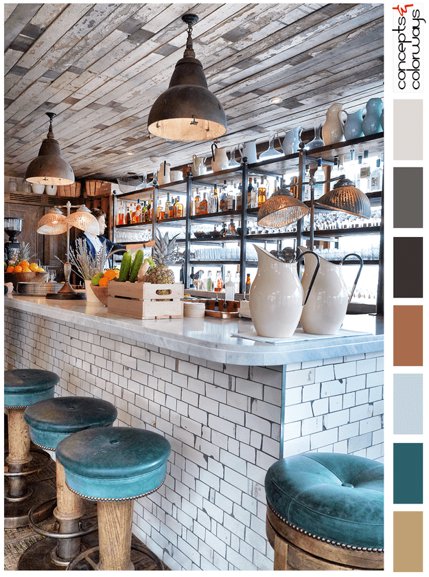
HAPPY HOUR
The 'Happy Hour' palette is a chill look with a "put your feet up and stay a while" kind of vibe. This look is all about reclaimed wood, weathered subway tile and dark teal accents. The color palette consists of a light brown, dark teal, pale blue, copper brown, warm black, charcoal gray, pale gray ...
KATARA MEDALLION
The 'Katara Medallion' palette revolves around a gorgeous turquoise blue. The full color palette is a dark navy, turquoise blue, sage gray, creamy ivory, brassy brown, warm beige and avocado green. This look is bright and fresh with a tranquil vibe. Here's a look at the 'Katara Medallion' paint ...
- 1
- 2
- 3
- 4
- Next Page »


